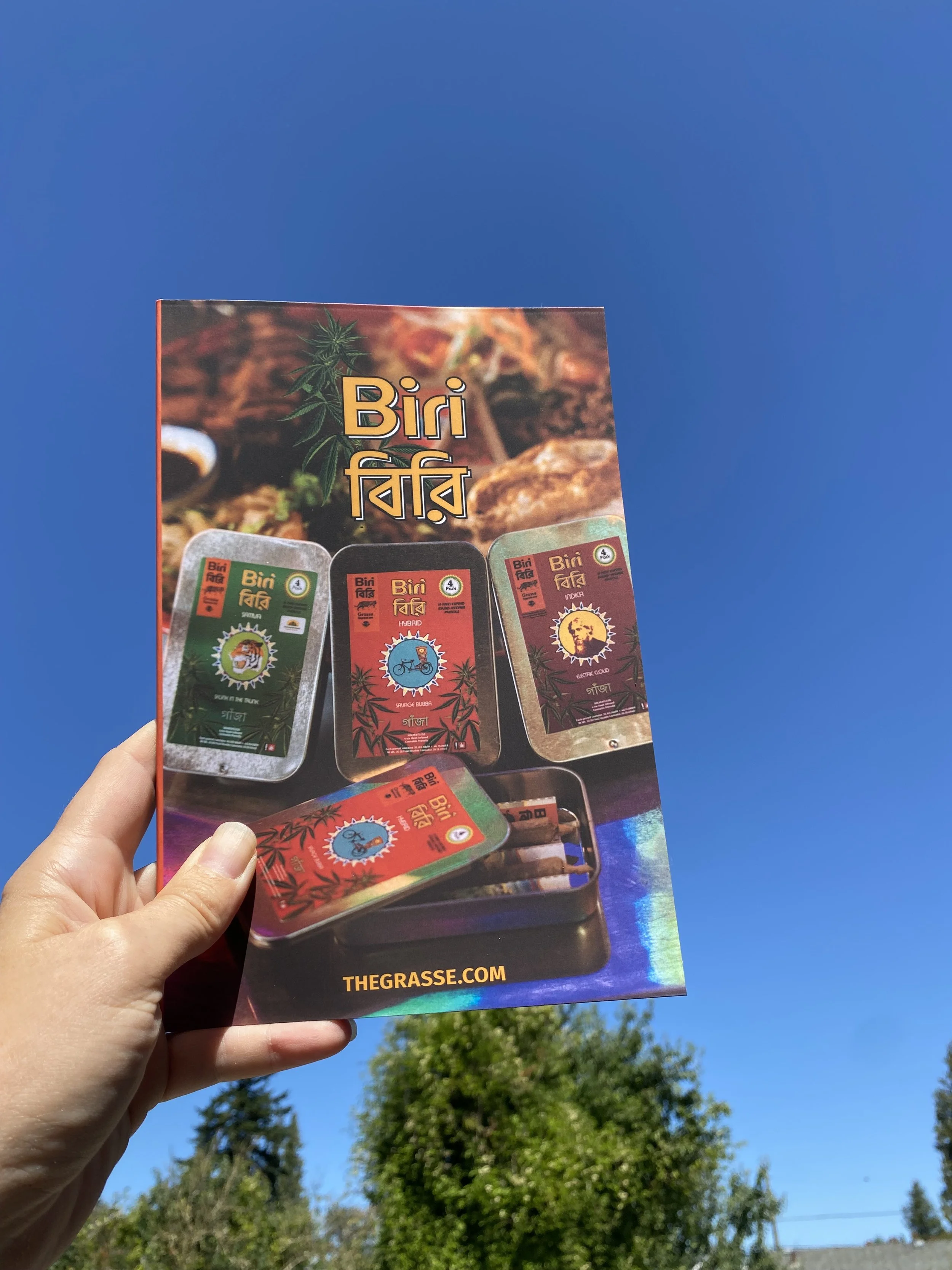
Look book design for Grasse to tell the story of Biri.
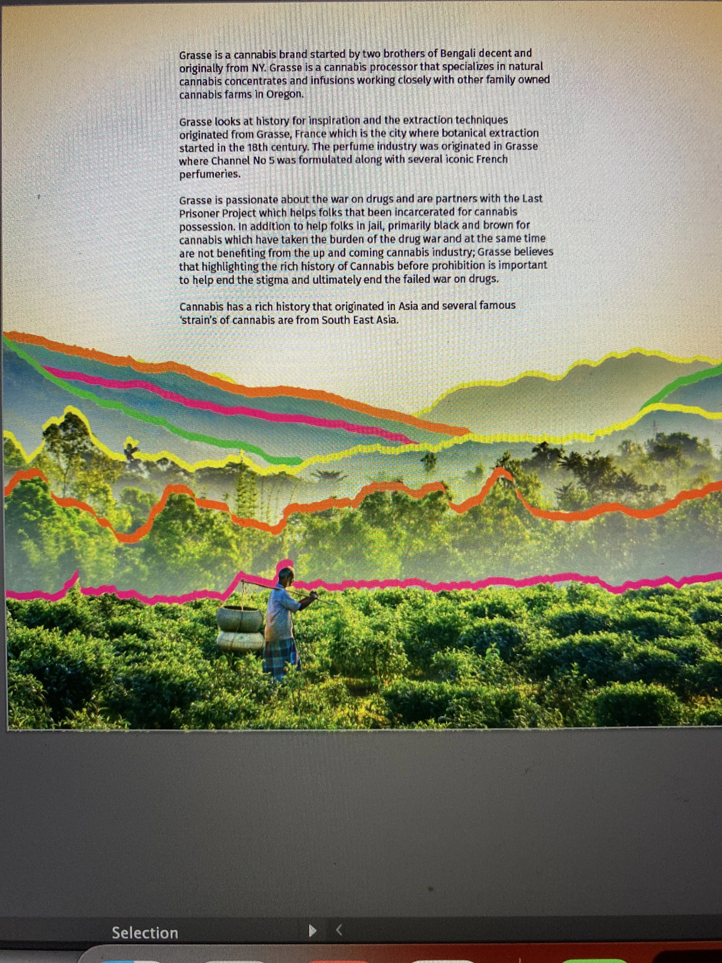
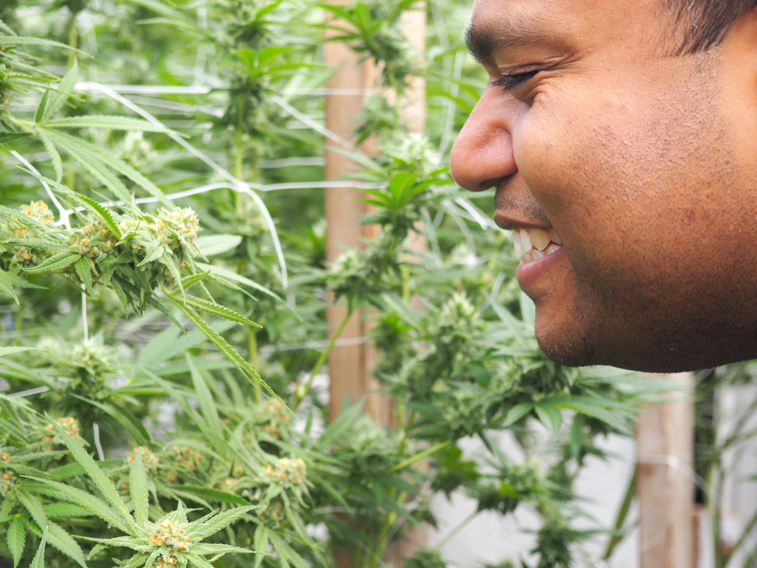
While most companies are defaulting to hype-beastesque strategies, others are staying close to craft and tradition in the cannabis space. Oregon cannabis processor, Grasse, contacted SESH Creative to design a new brand for their organization. They were looking to build a multi-SKU consumer product for the Oregon cannabis market. The design direction was to draw from the founders’ family history and the diverse background of cannabis.
Research and Inspiration
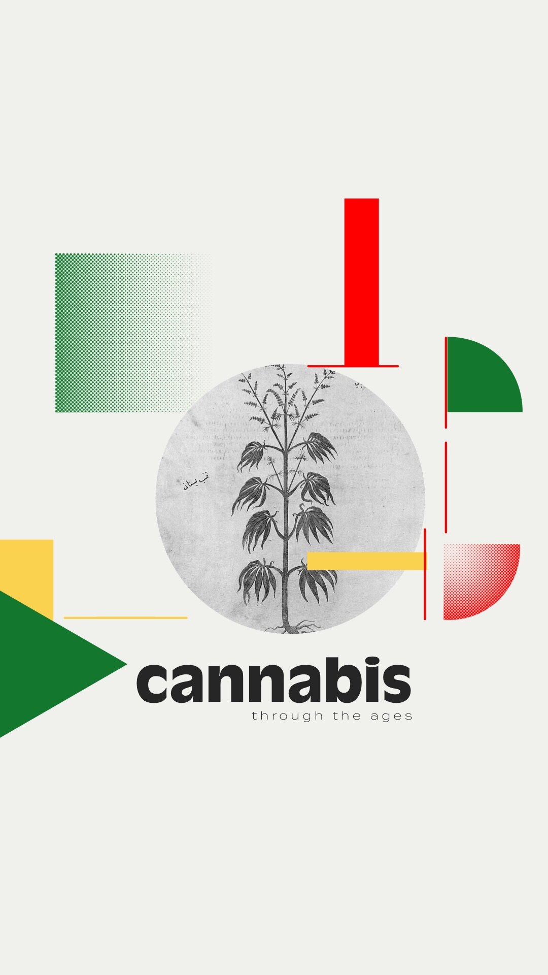
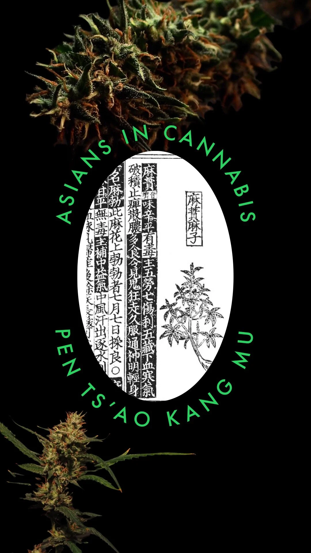
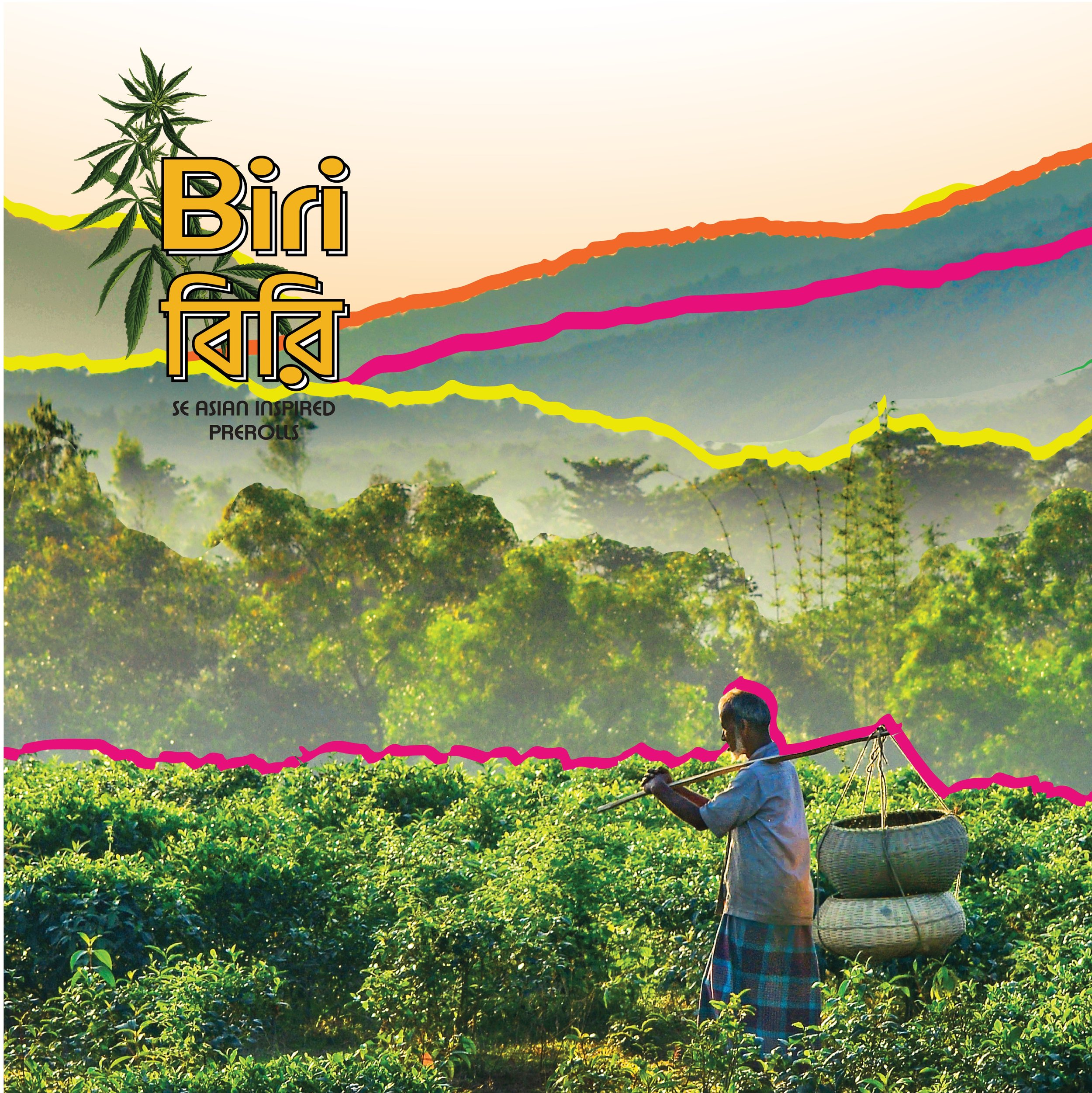
This heritage brand project brought new perspectives, new challenges, and a bunch of new community members. We kicked off the project with an interview as a standard practice and gleaned some insights for the initial bit of research and inspiration. We found that cannabis originated in Asia as far back as 2900 BCE. We also found some great folks who are advocating for Asians in cannabis. Most people do not include the injustices the Asian community suffers from the war on drugs. This is due to the “other” category when institutions are collecting data. However, the research is out there about indigenous Asian plants, utilitarian, spiritual, medicinal uses of cannabis, and deep wounds from slave trades through the contemporary war on drugs. It just takes acknowledgement from policy makers to justify validation.
We recognized this brand had an opportunity to tell this story and unite a community around cannabis.
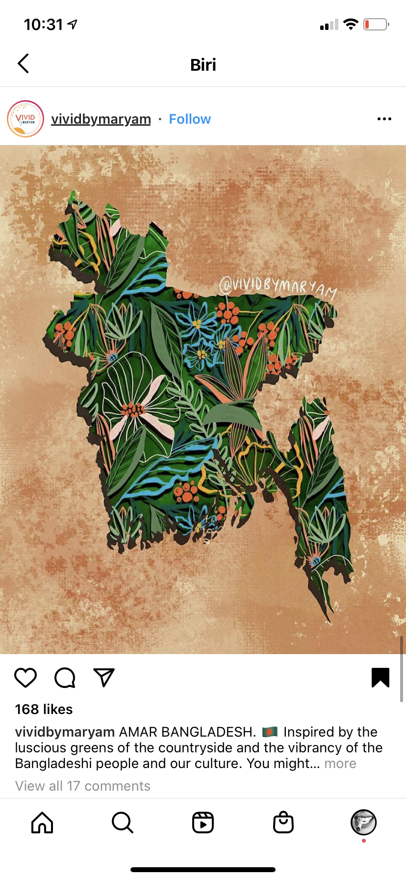
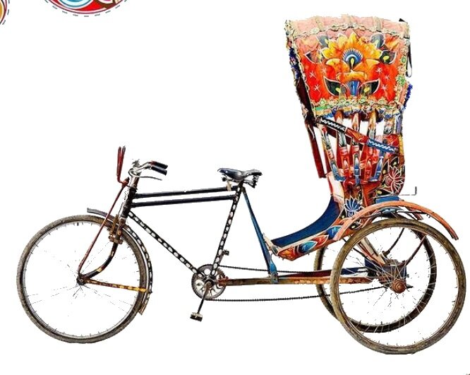
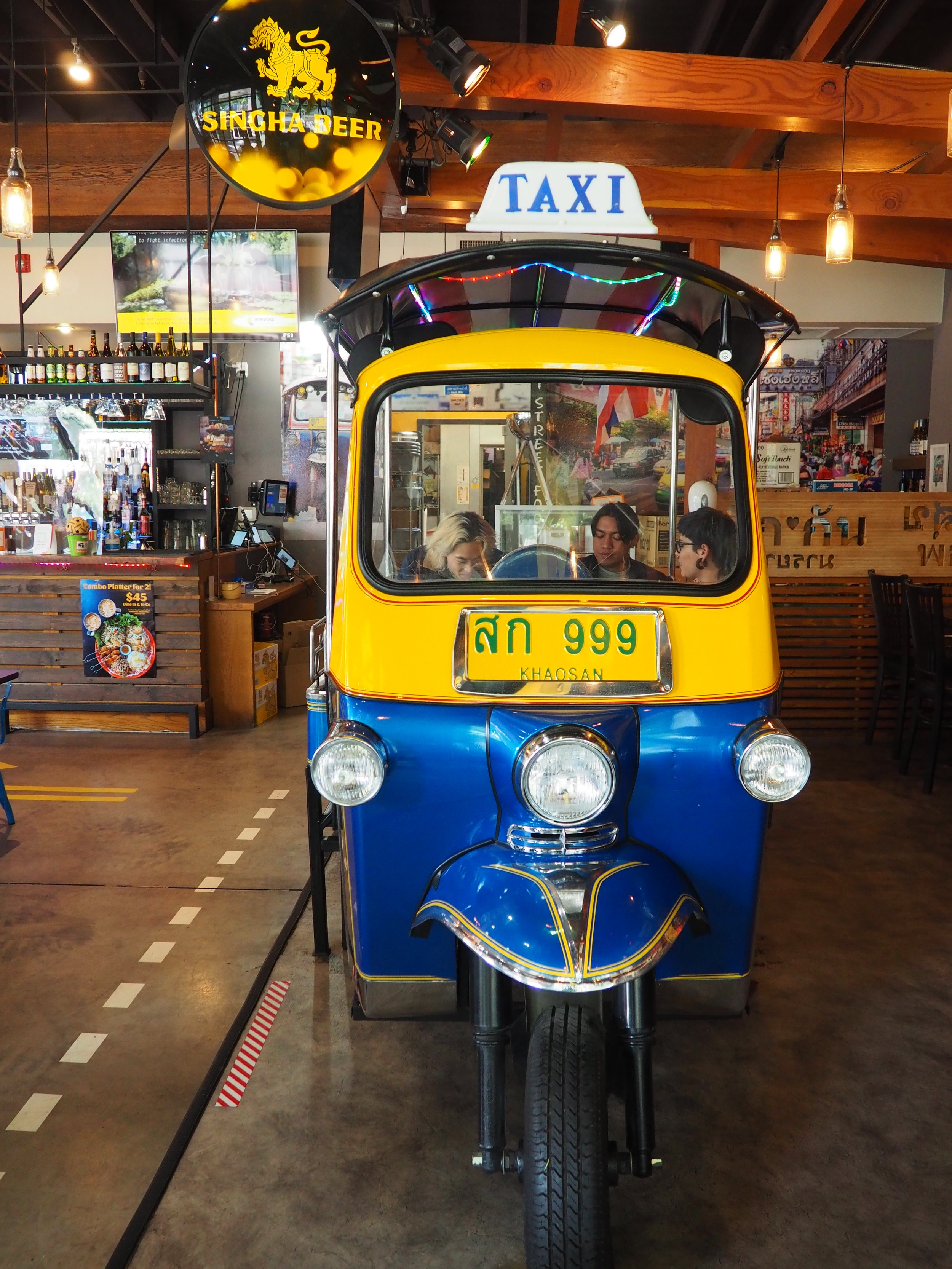
The Rickshaw
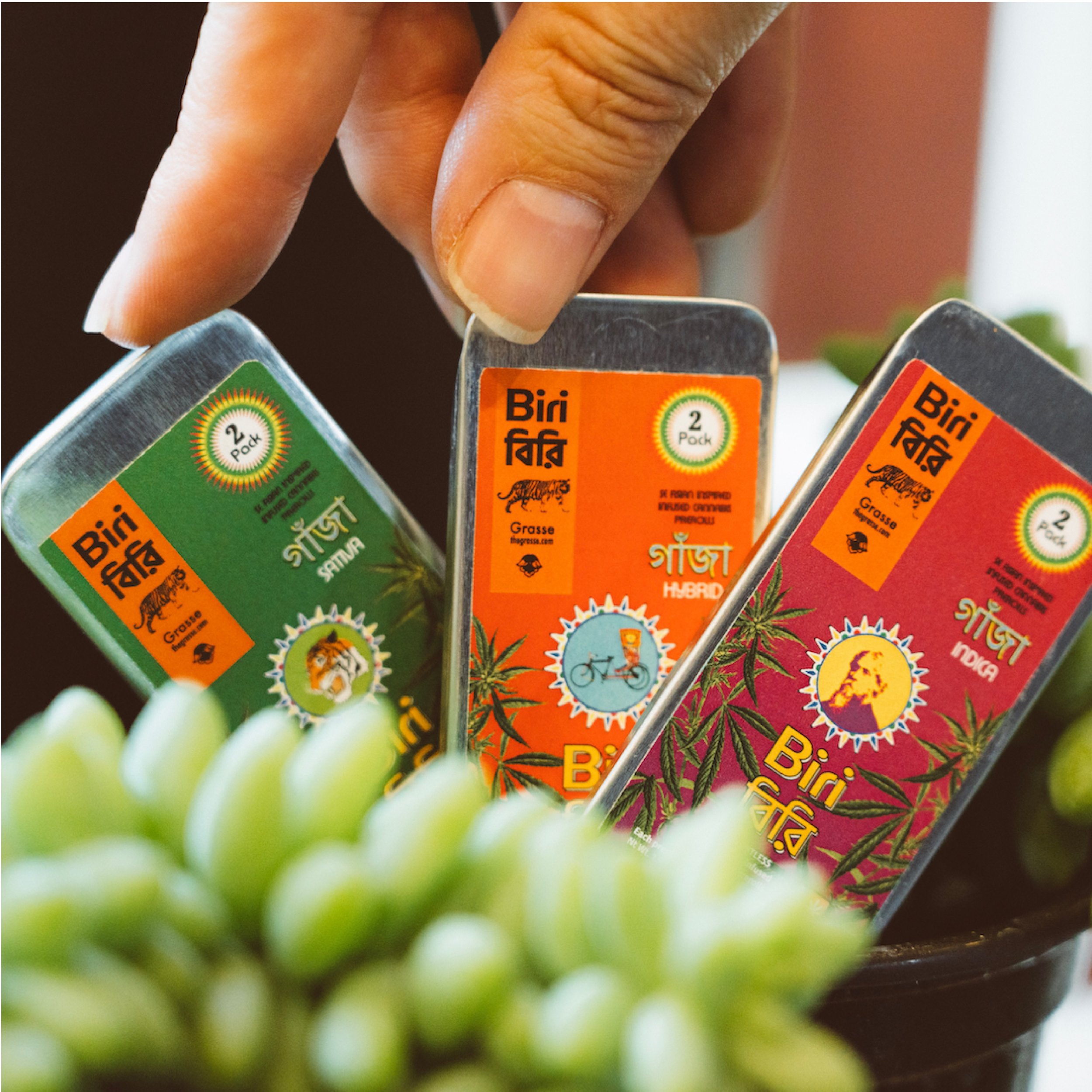
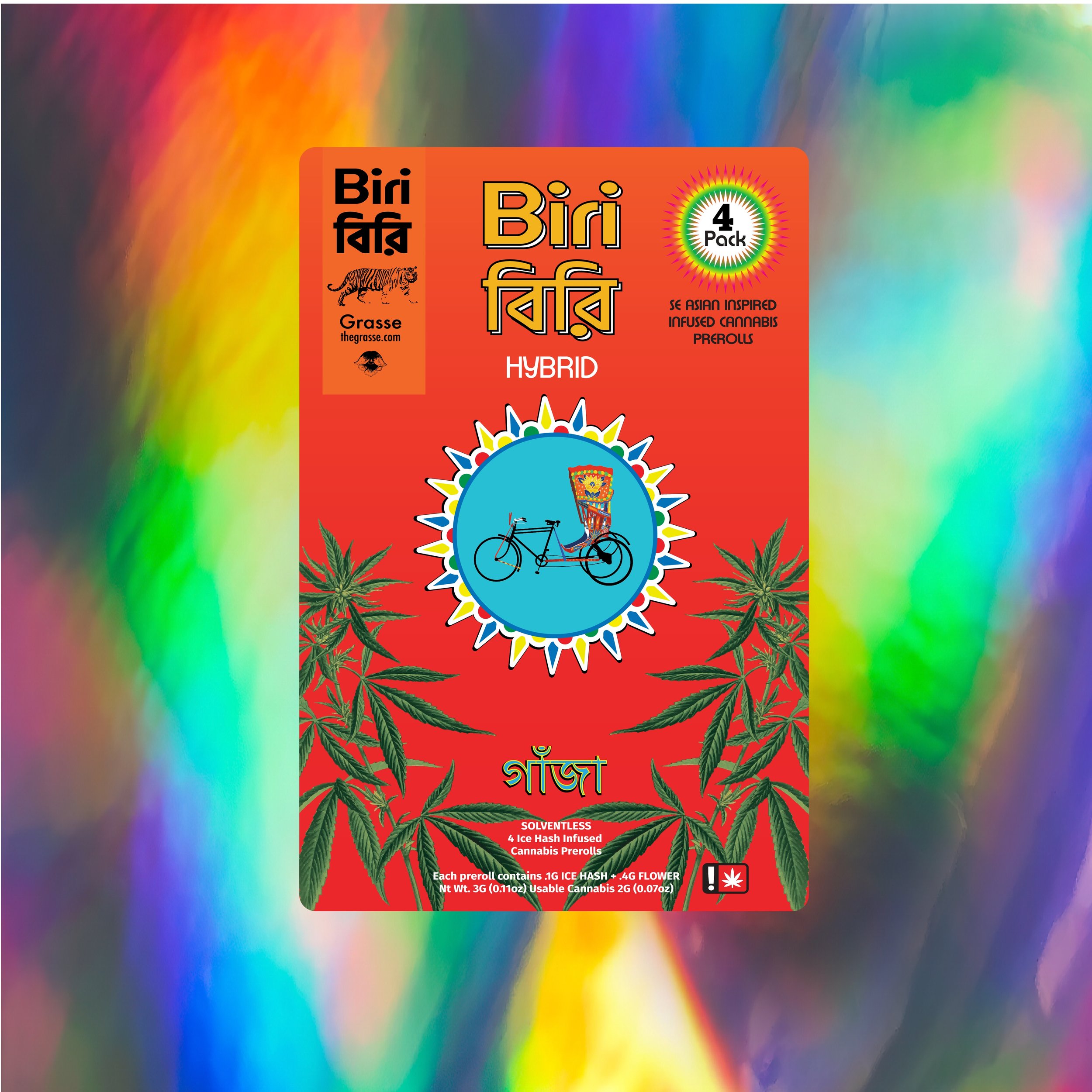
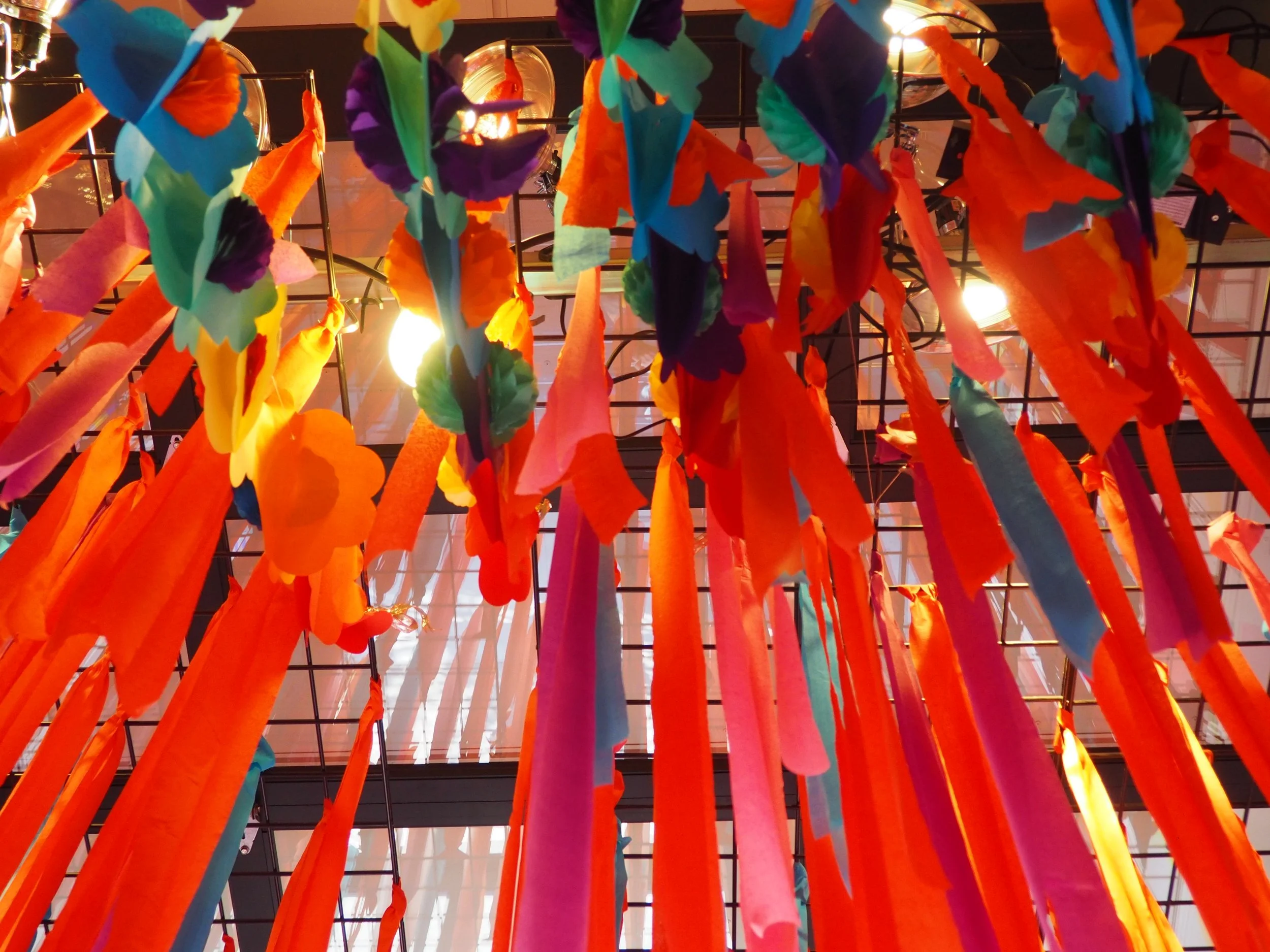
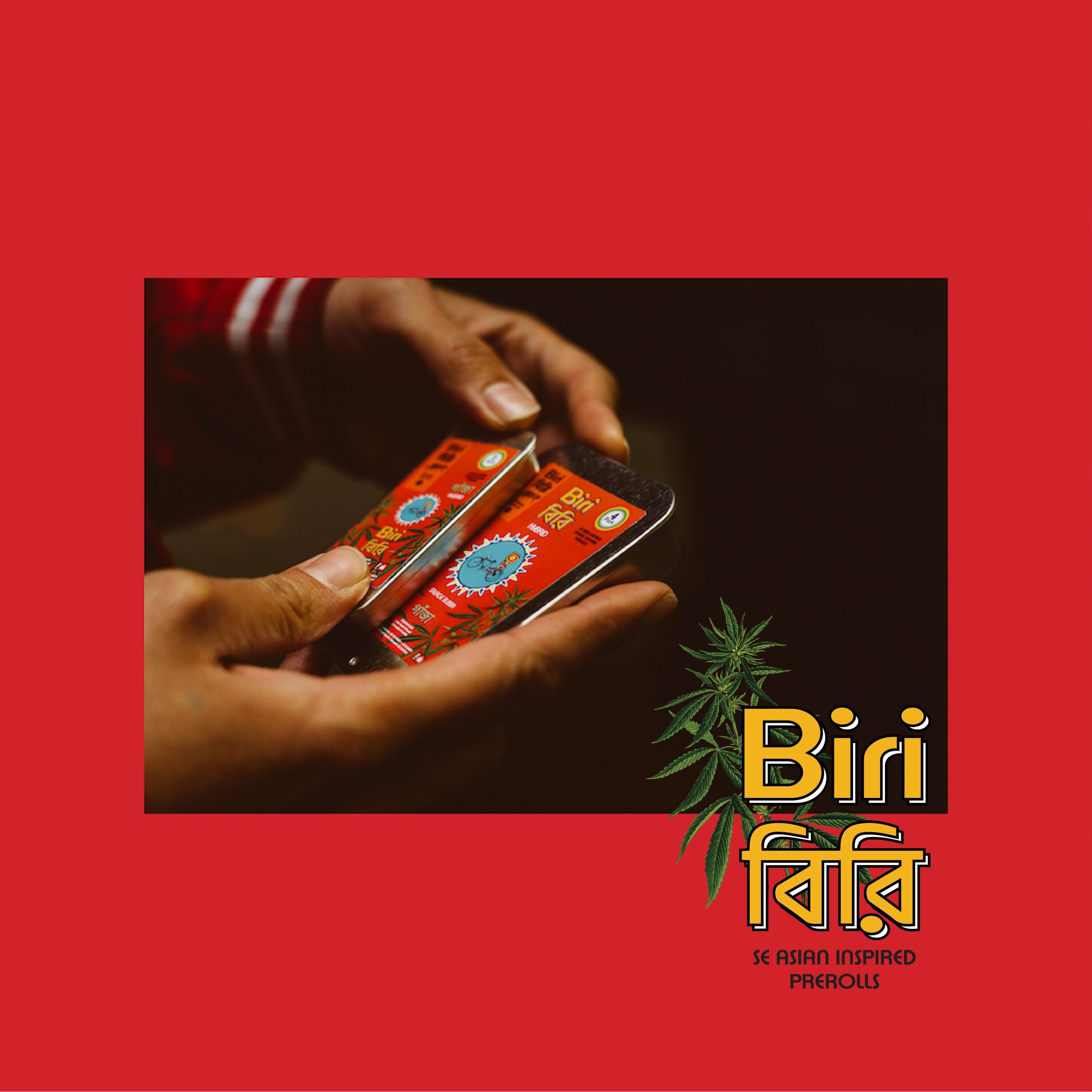
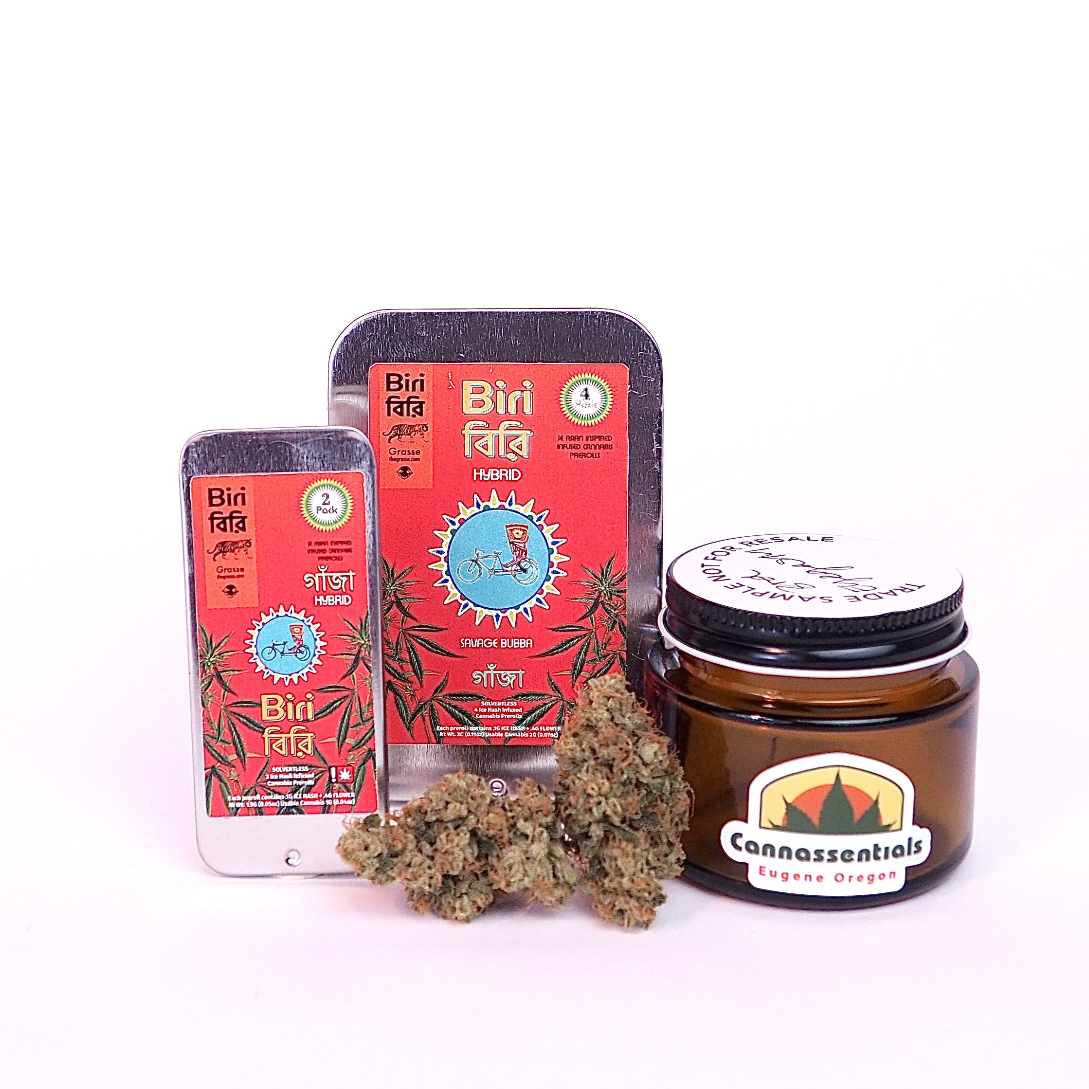
The Grasse founders had great suggestions to immerse one’s self in the rich history of Bangladesh. One element stood out, the rickshaw. These common modes of transportation are hand carried or bicycle powered, you can even find the more evolved tuk tuk jeeps zipping around too. Each of these vehicles are vibrantly painted and illustrate the style of the region or the drivers themselves. We distilled the sentiments of the South Asian metro life and created a label to honor the aesthetic of the rickshaw and Bengali people.
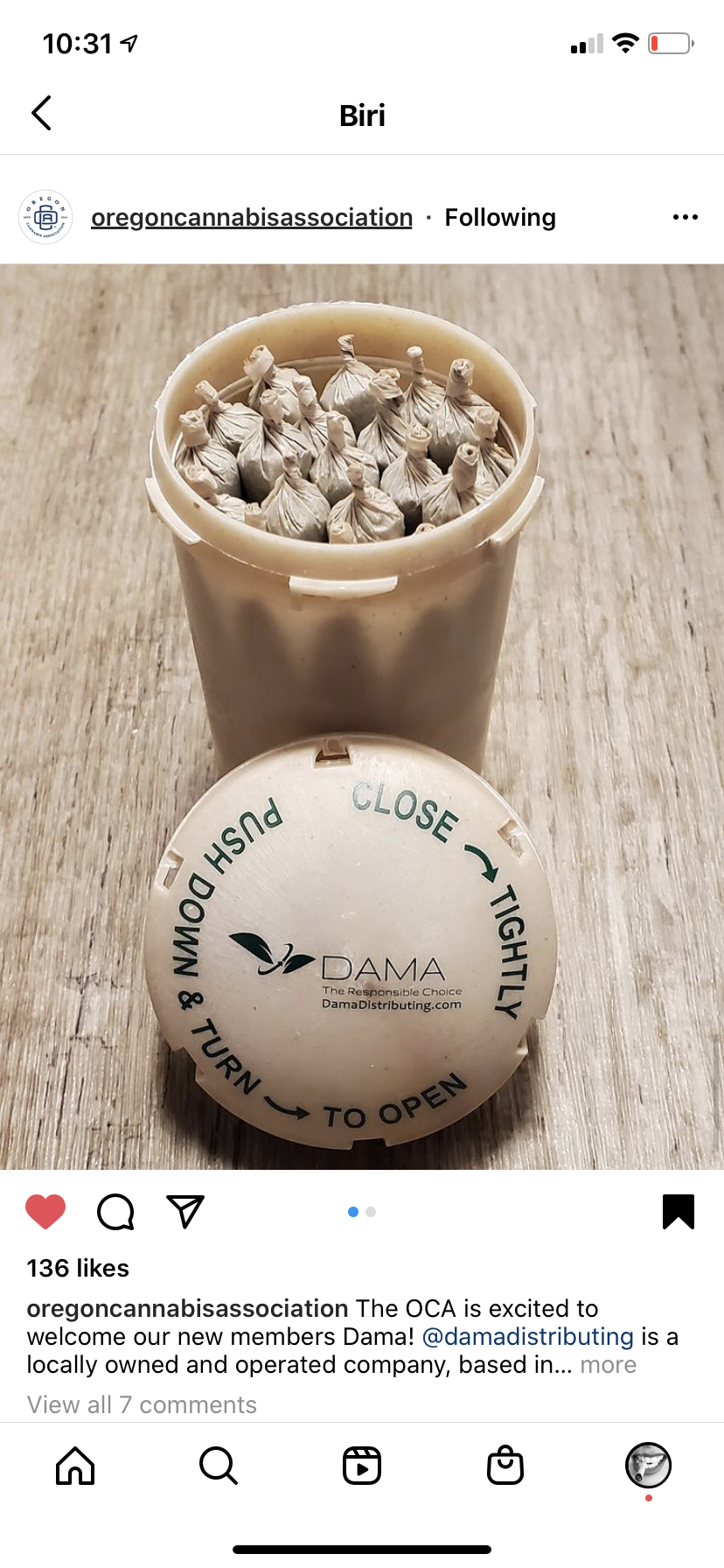
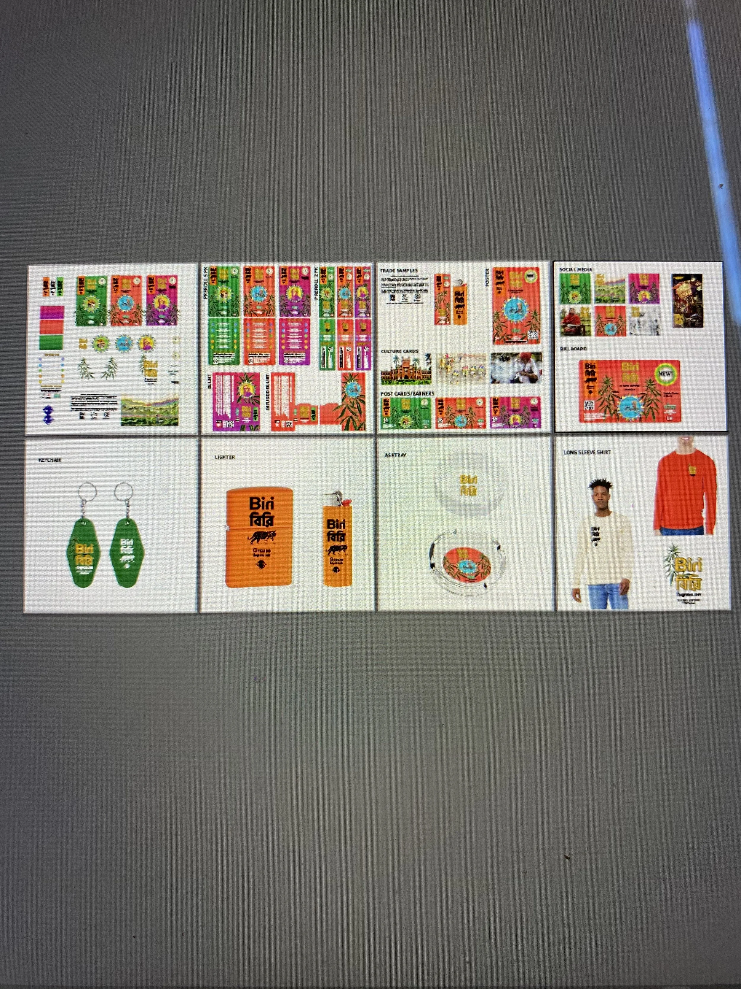
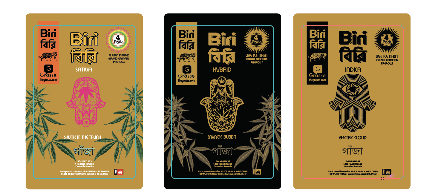
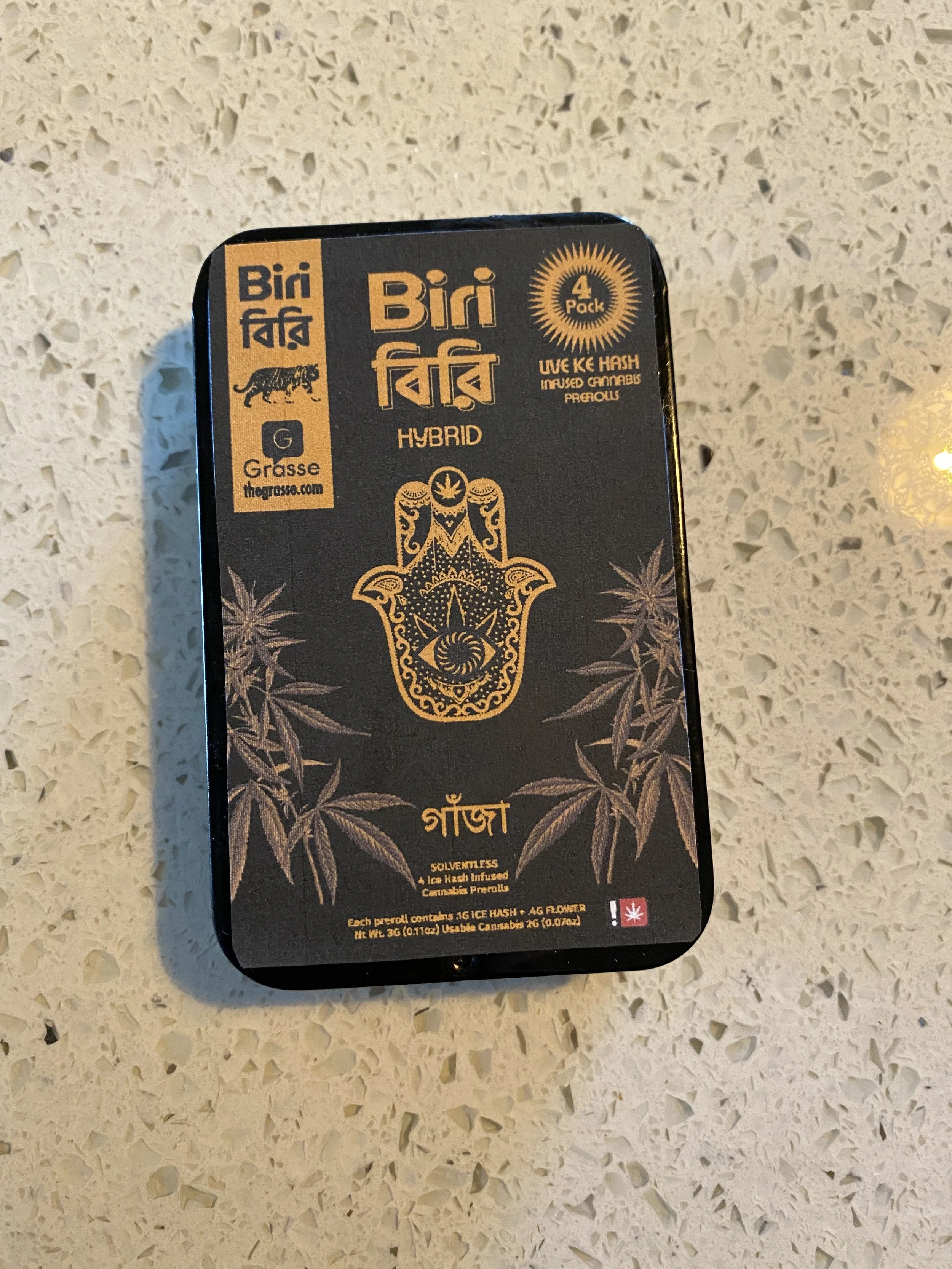
Packaging
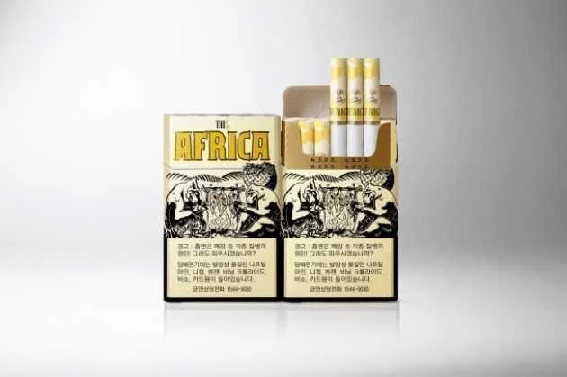
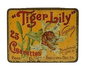
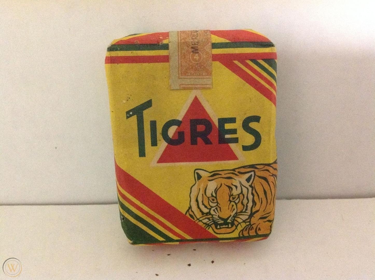
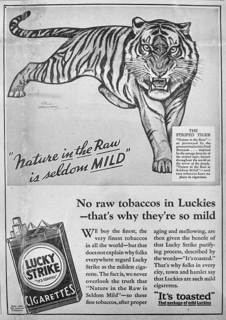
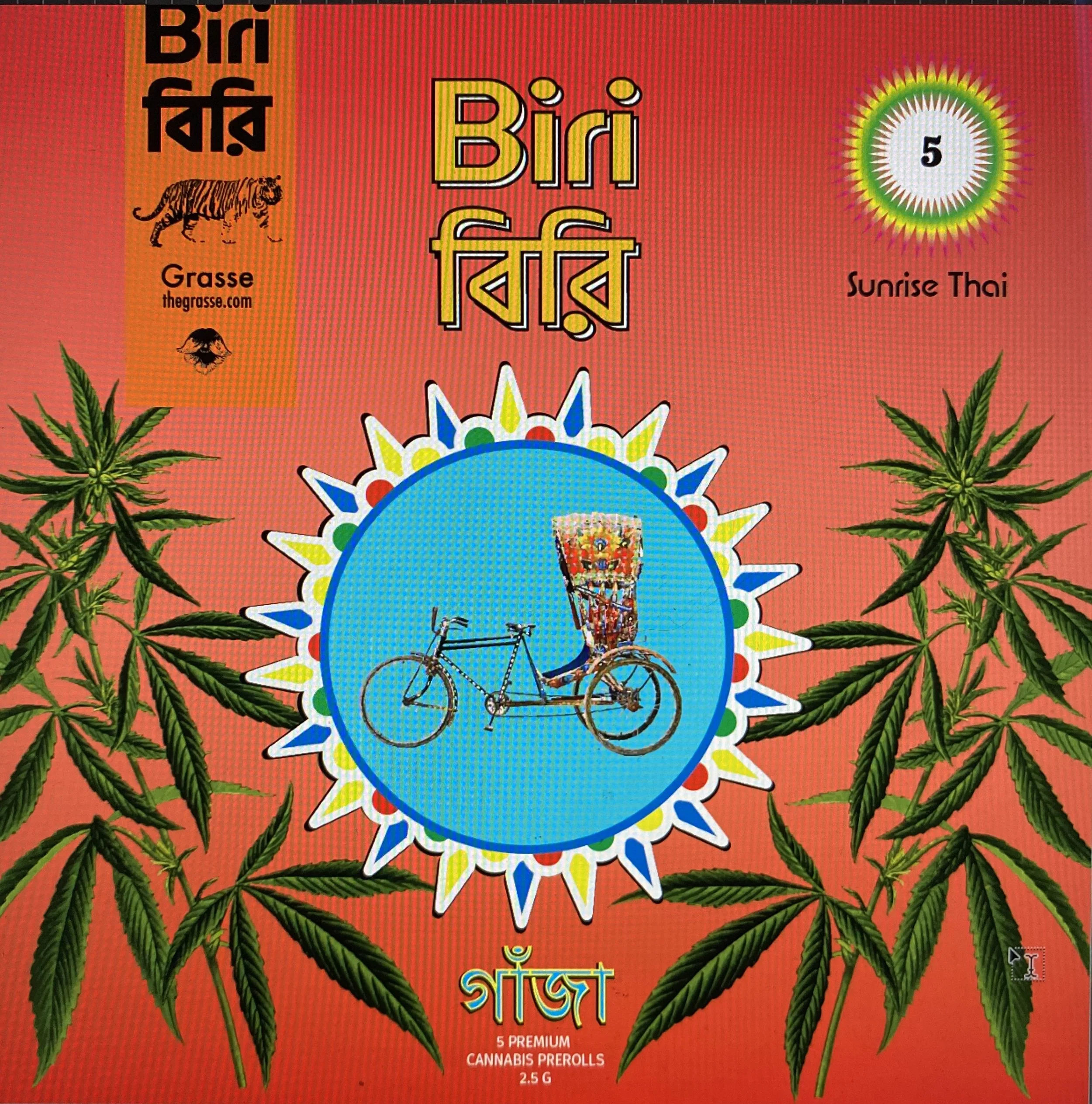
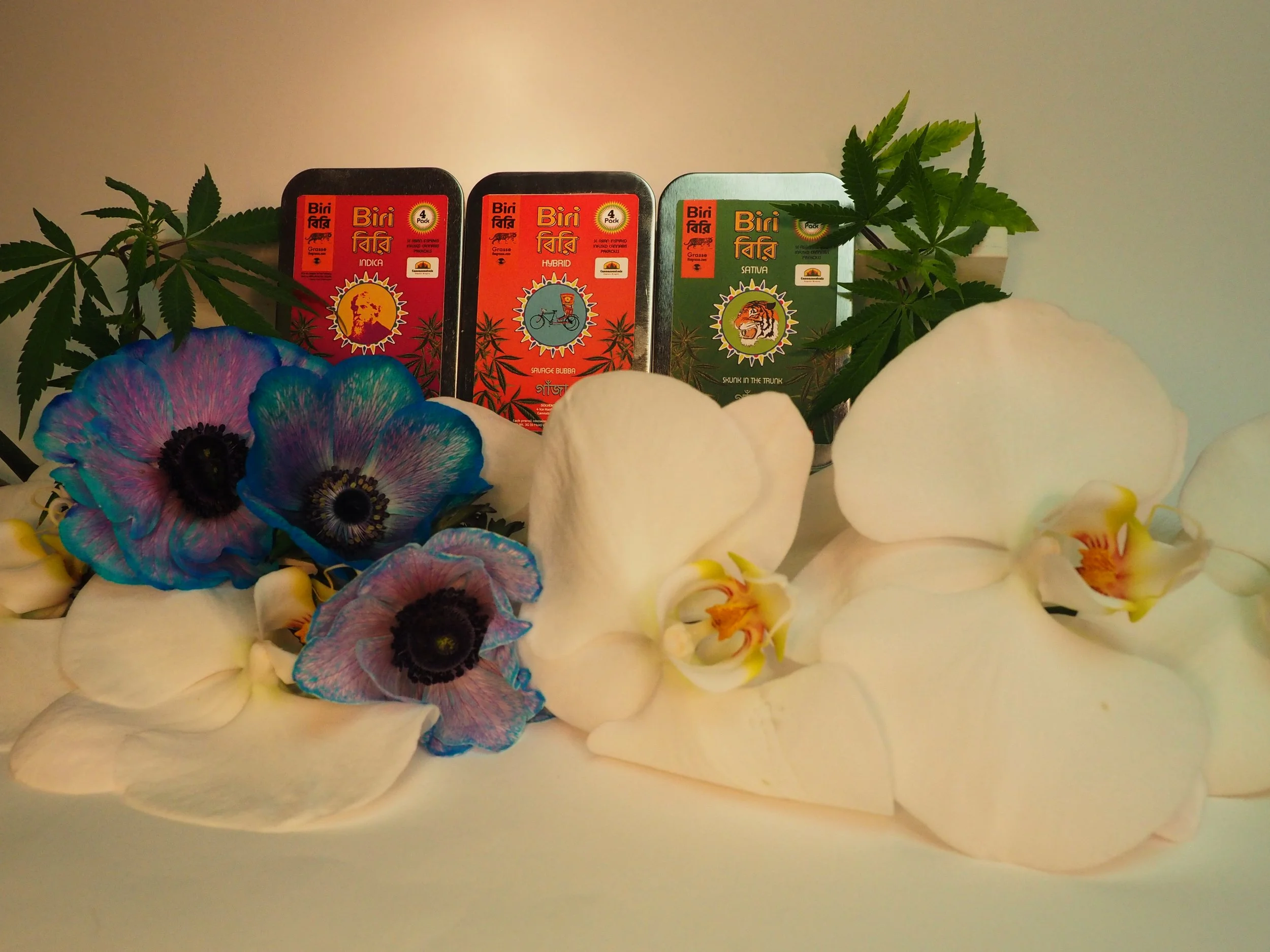
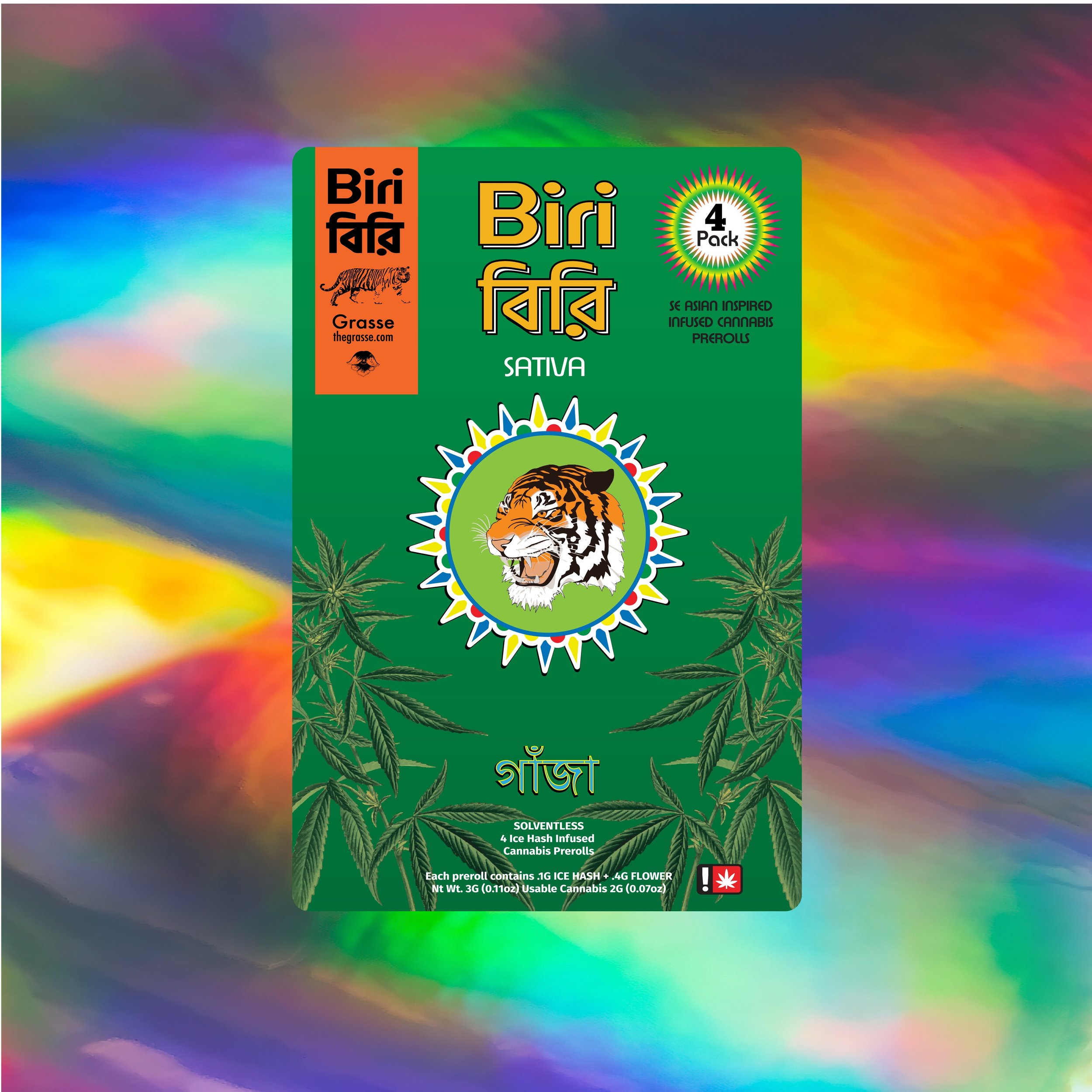
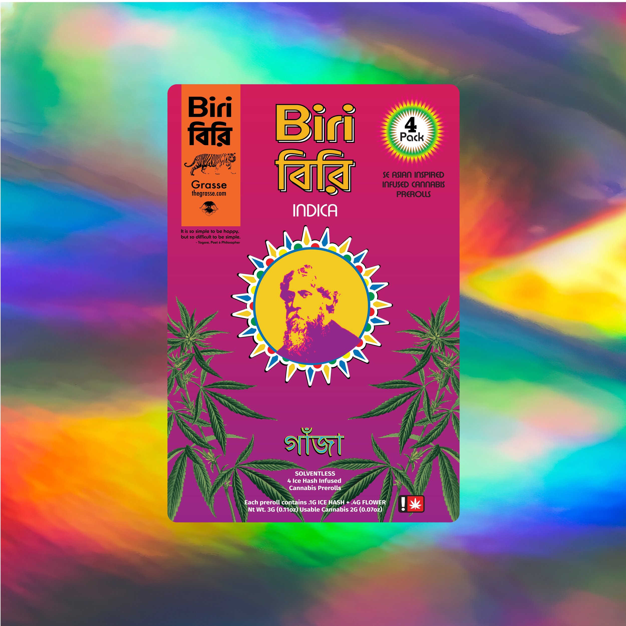
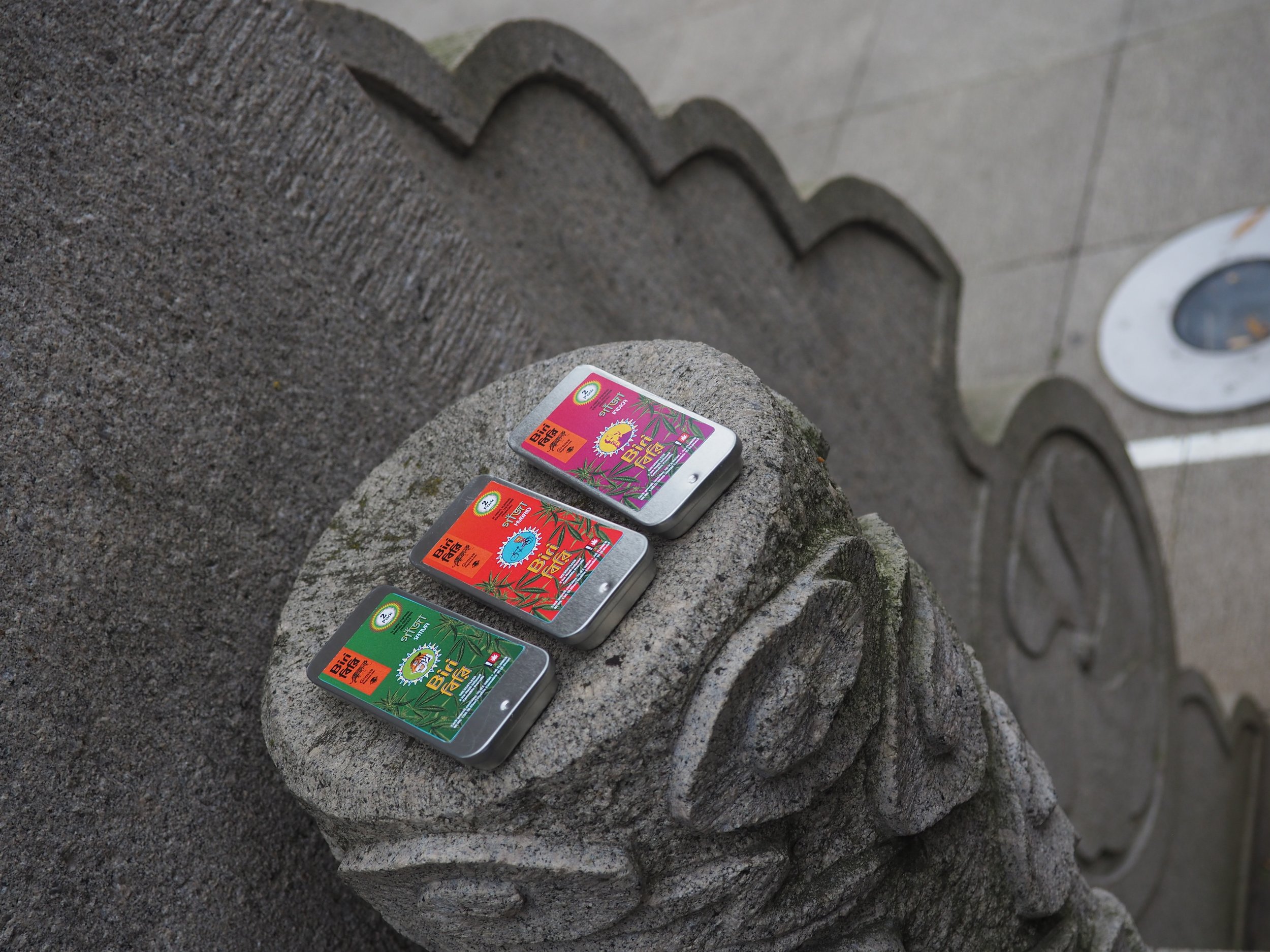
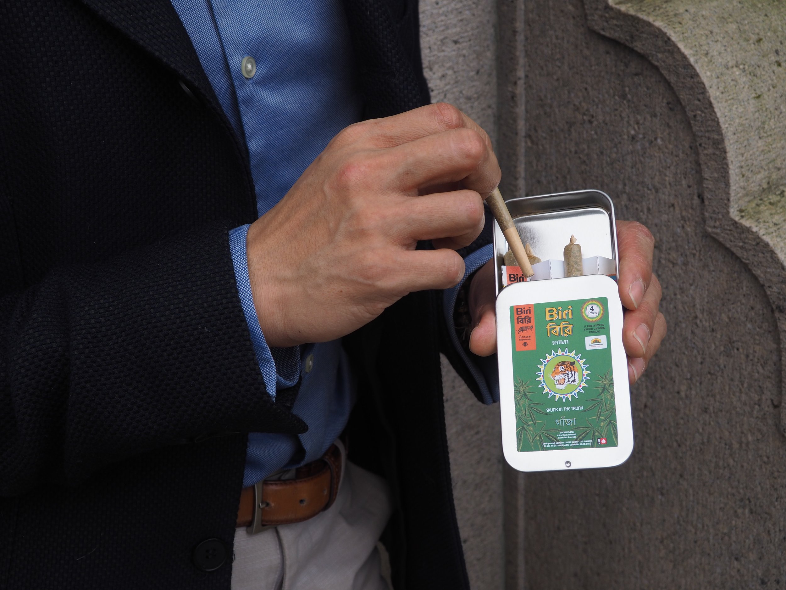
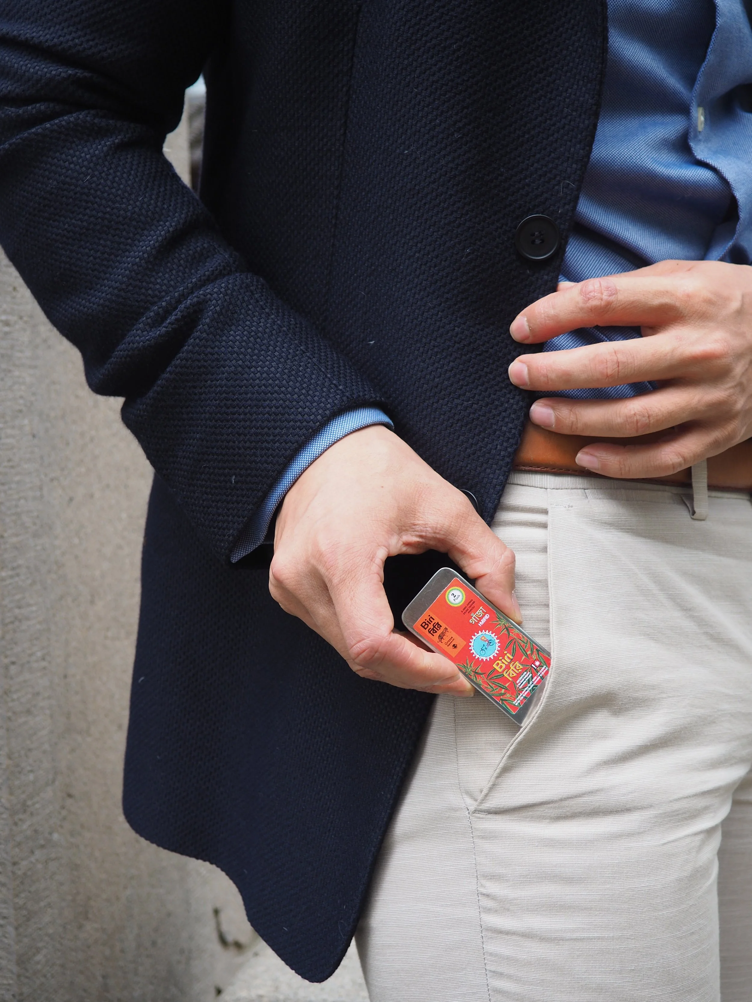
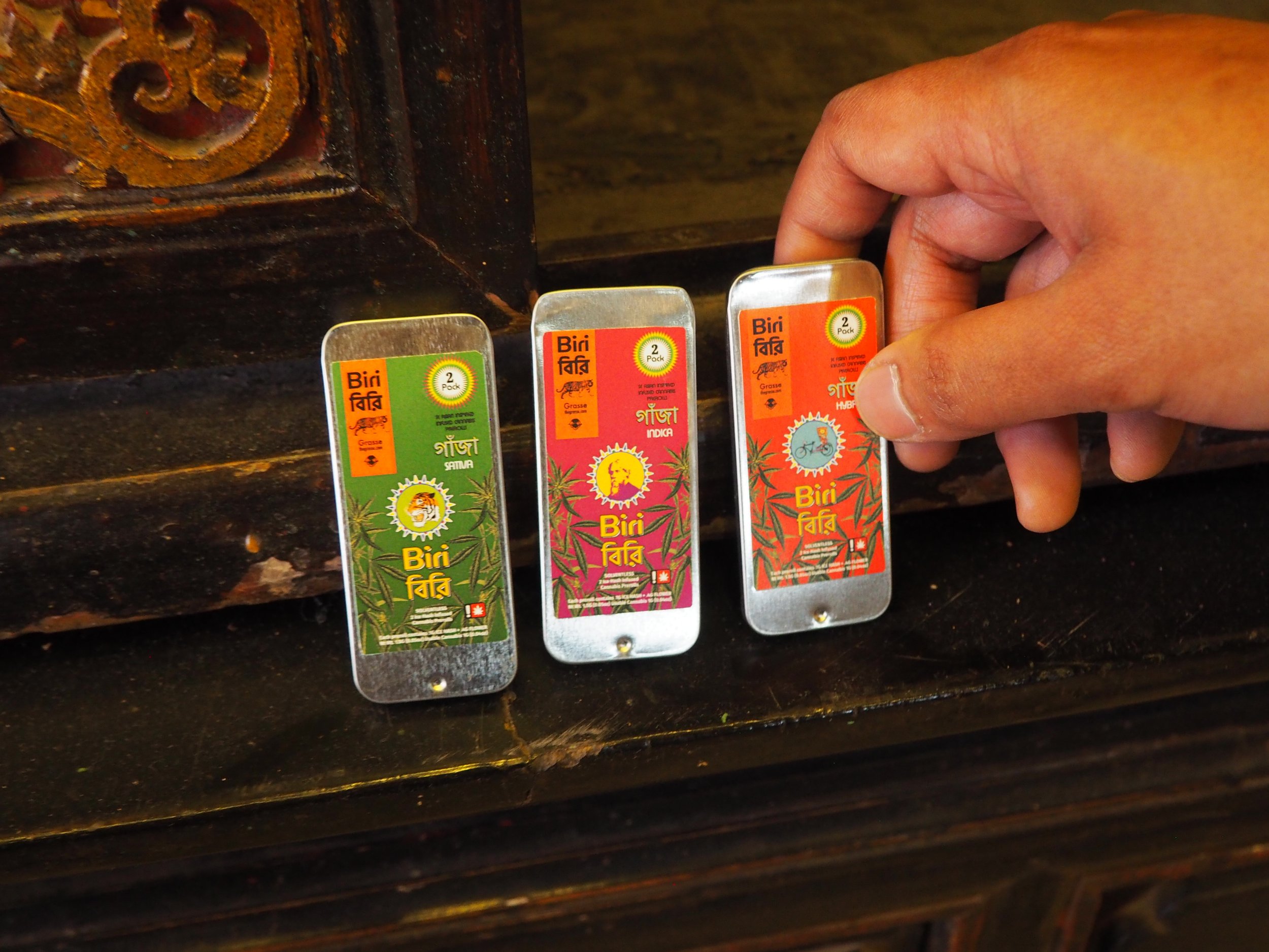
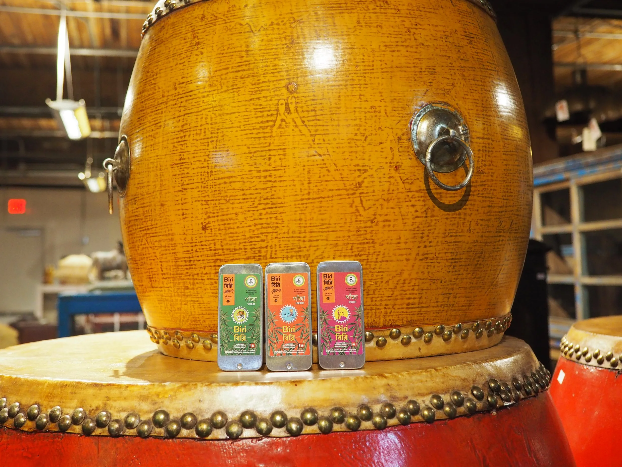
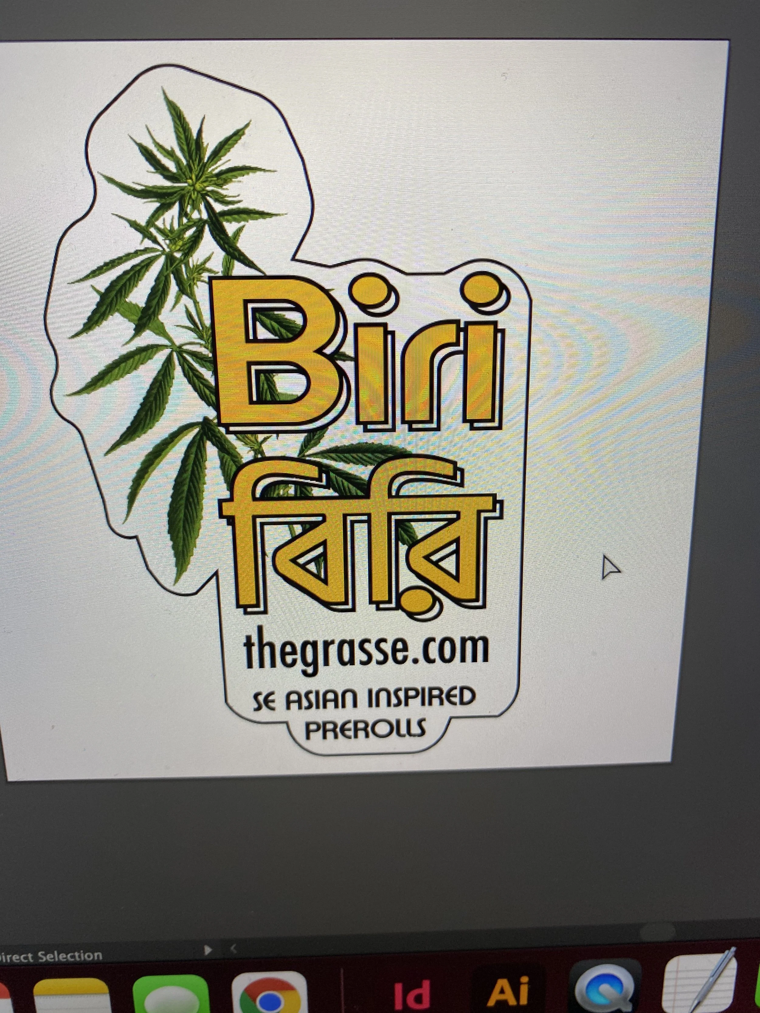
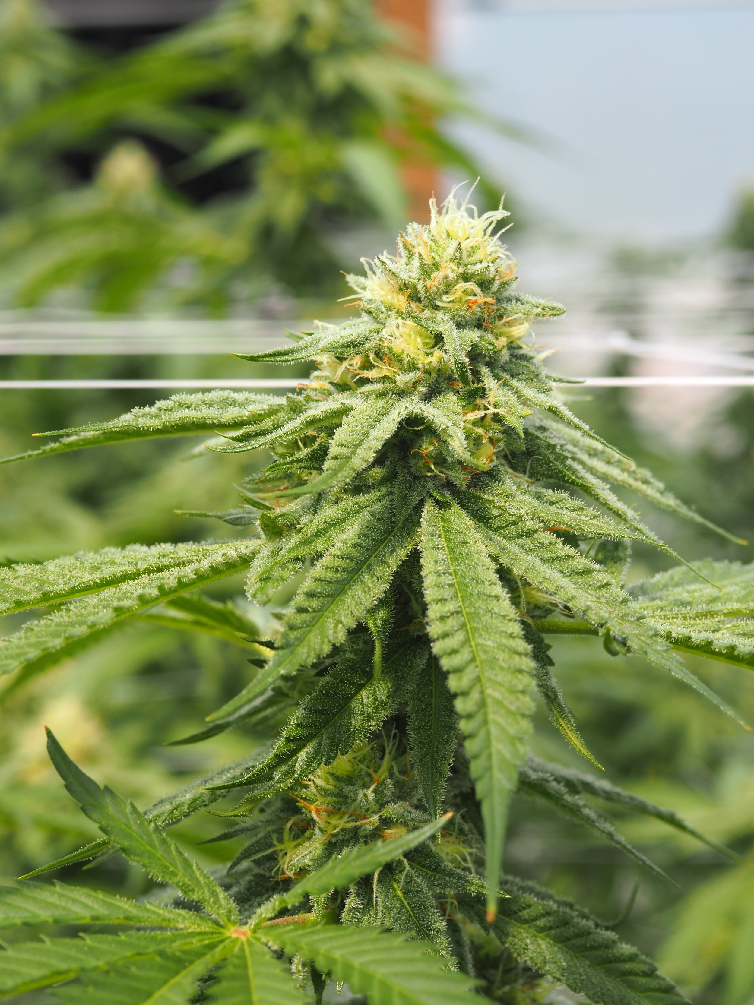
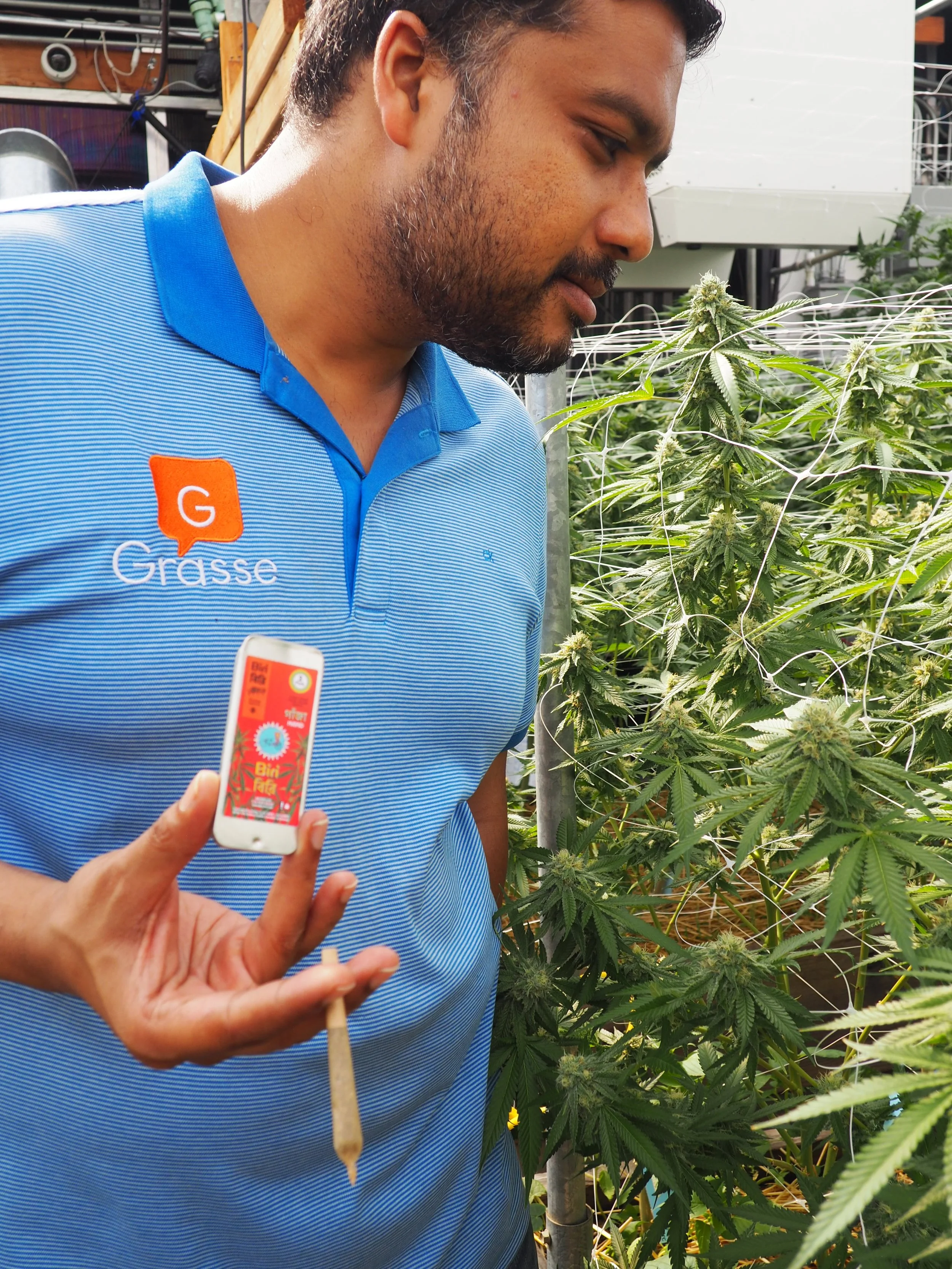
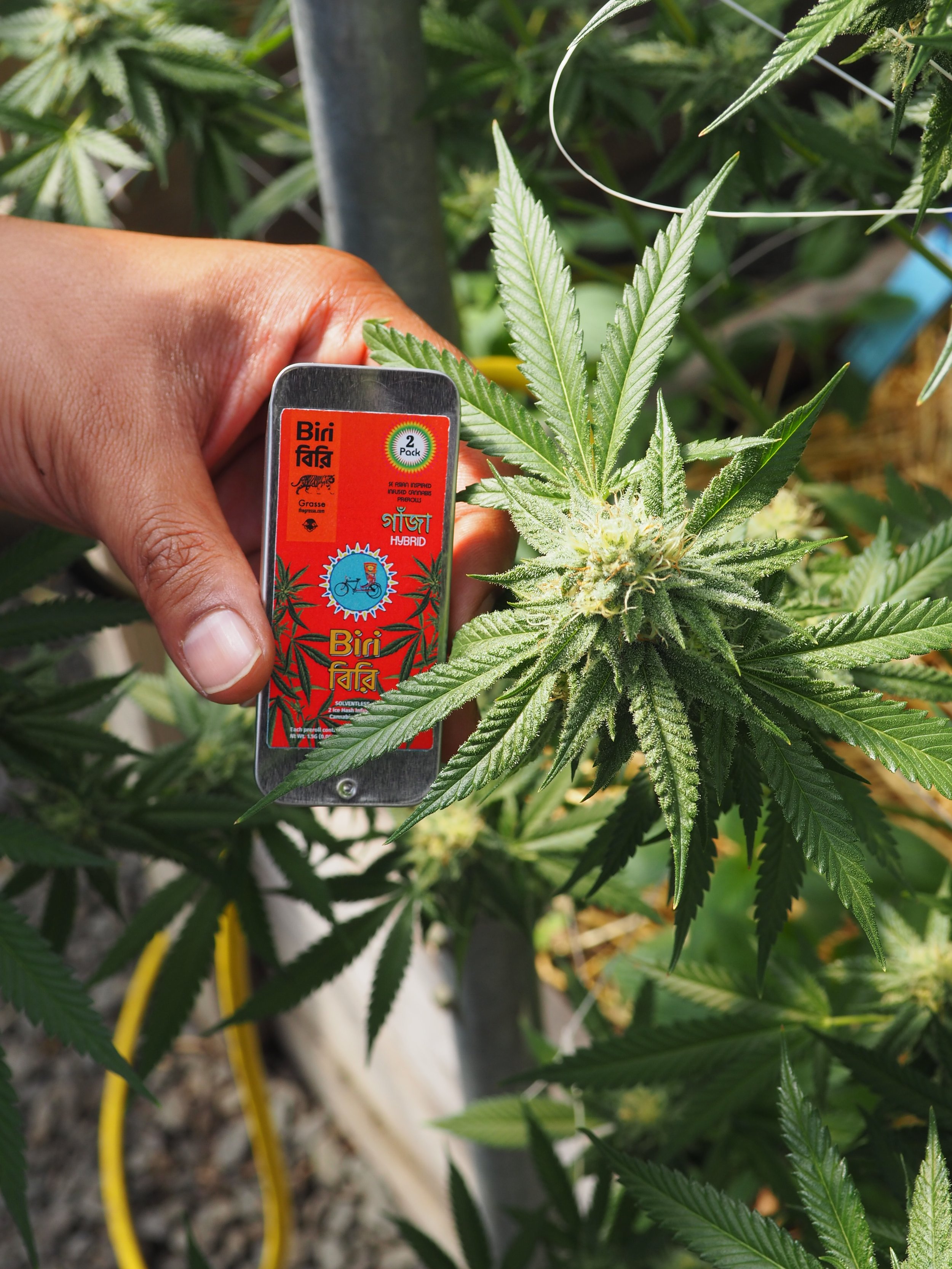
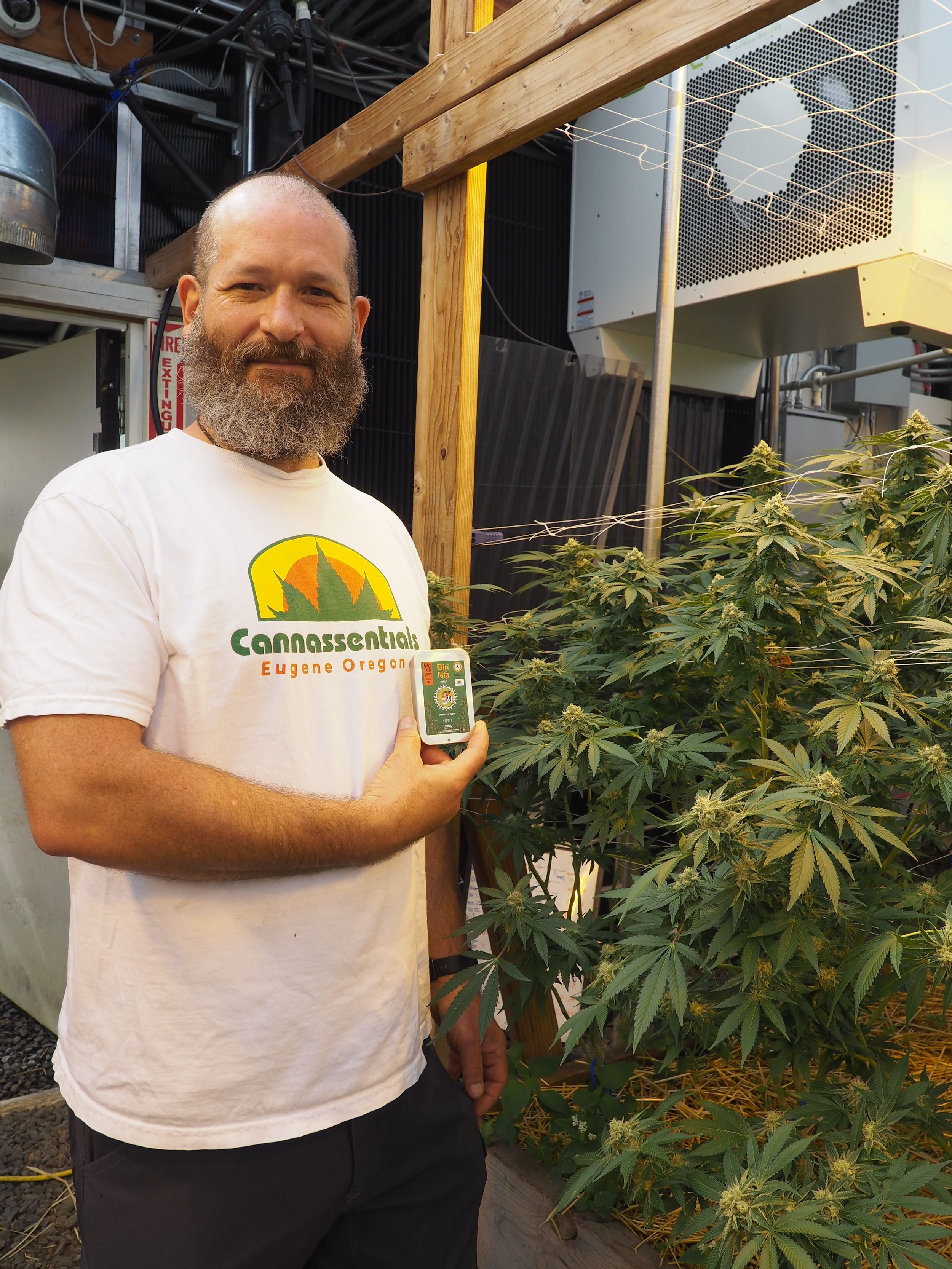
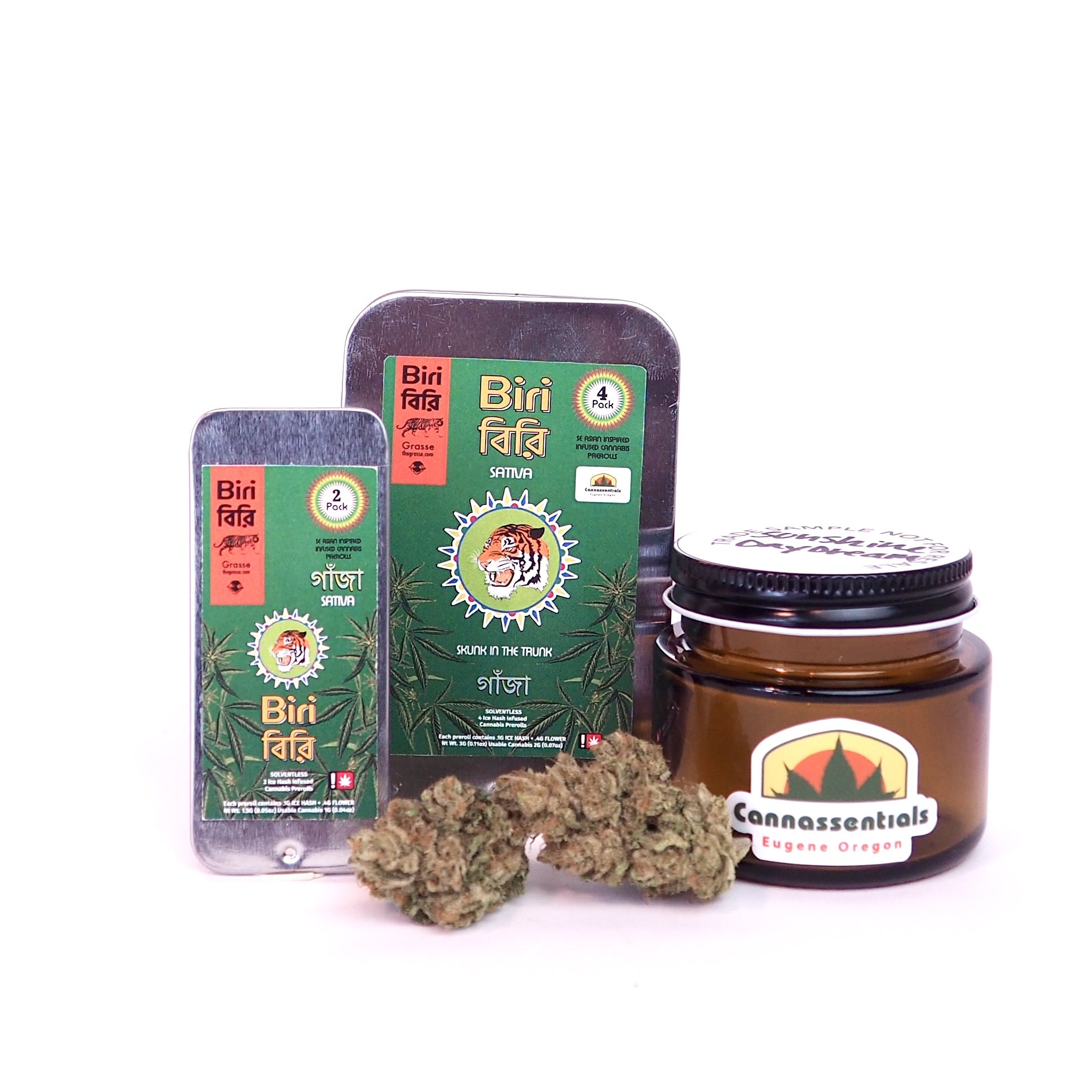
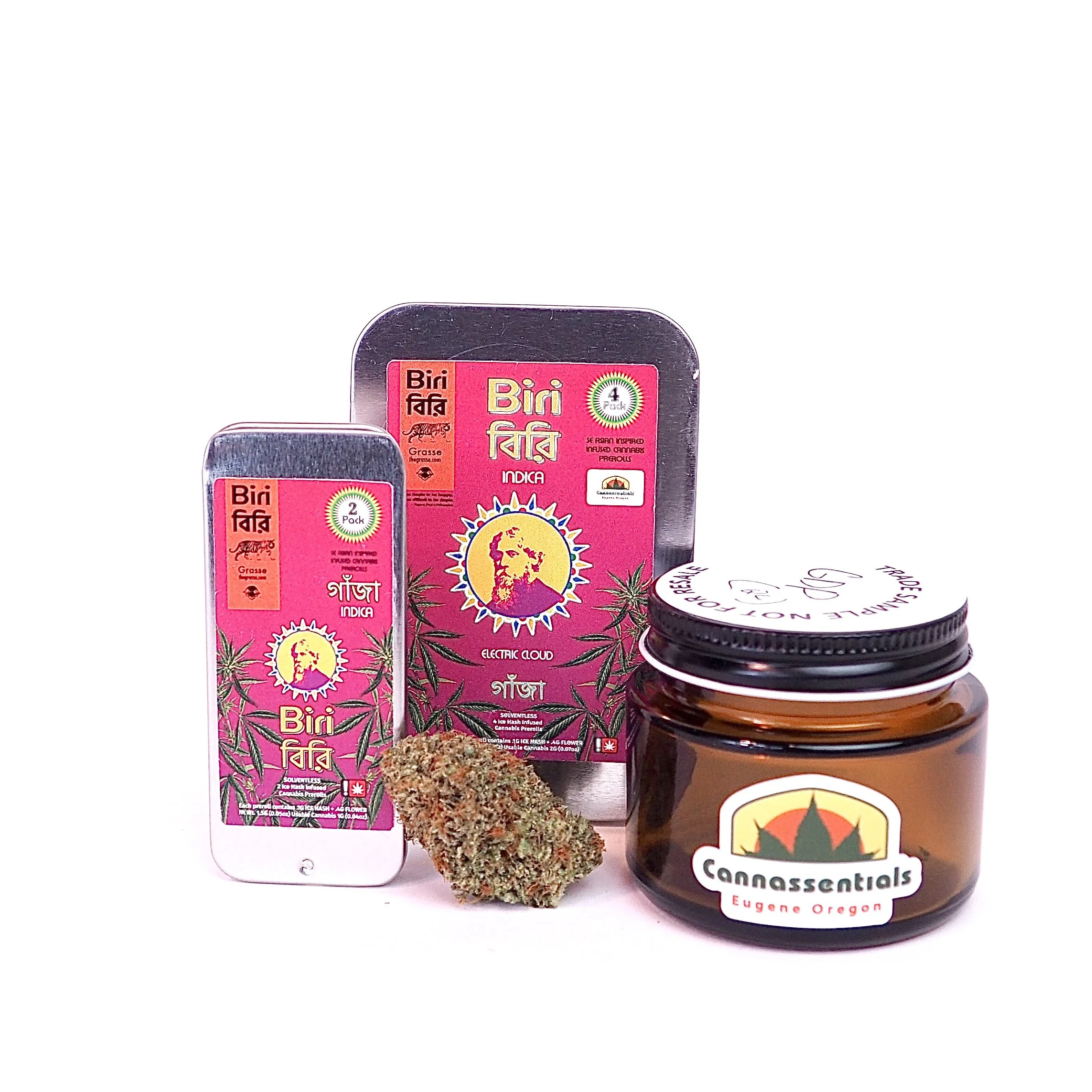
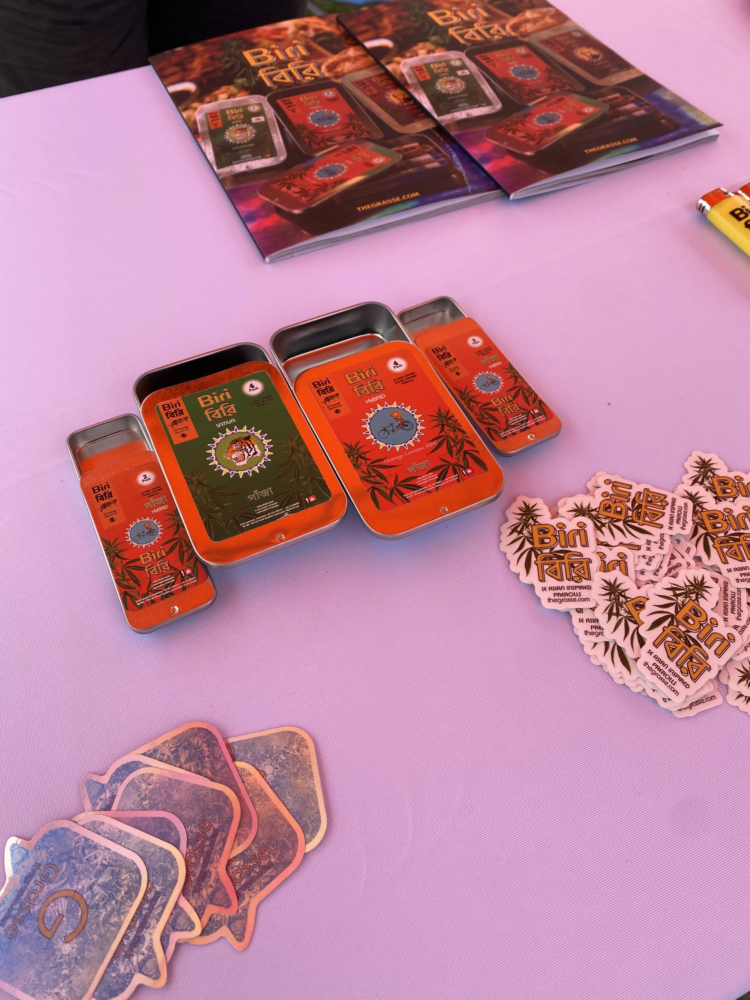
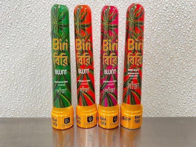
After looking at multiple varieties of packaging options, the client ran with the slider tin in a 4 pack and 2 pack variety. We looked at the constraints of the packaging and built off of our cultural research to develop the brand assets. Biri, the name and the brand. This is a traditional cigarette from South Asia, while some folks ask for Biri fafa, they are referring to the text below Biri which is biri in the Bengali language. You may also note another word in Bengali on the packaging. This reads “gamja” which is one of the original names for cannabis. We built out a vibrant color and typography family for the brand that had a vintage edge to it. The product symbology tiger, rickshaw, and Tagore, all shine a spotlight to the land, people, and cultural aspects of Bangladesh.
Lifestyle
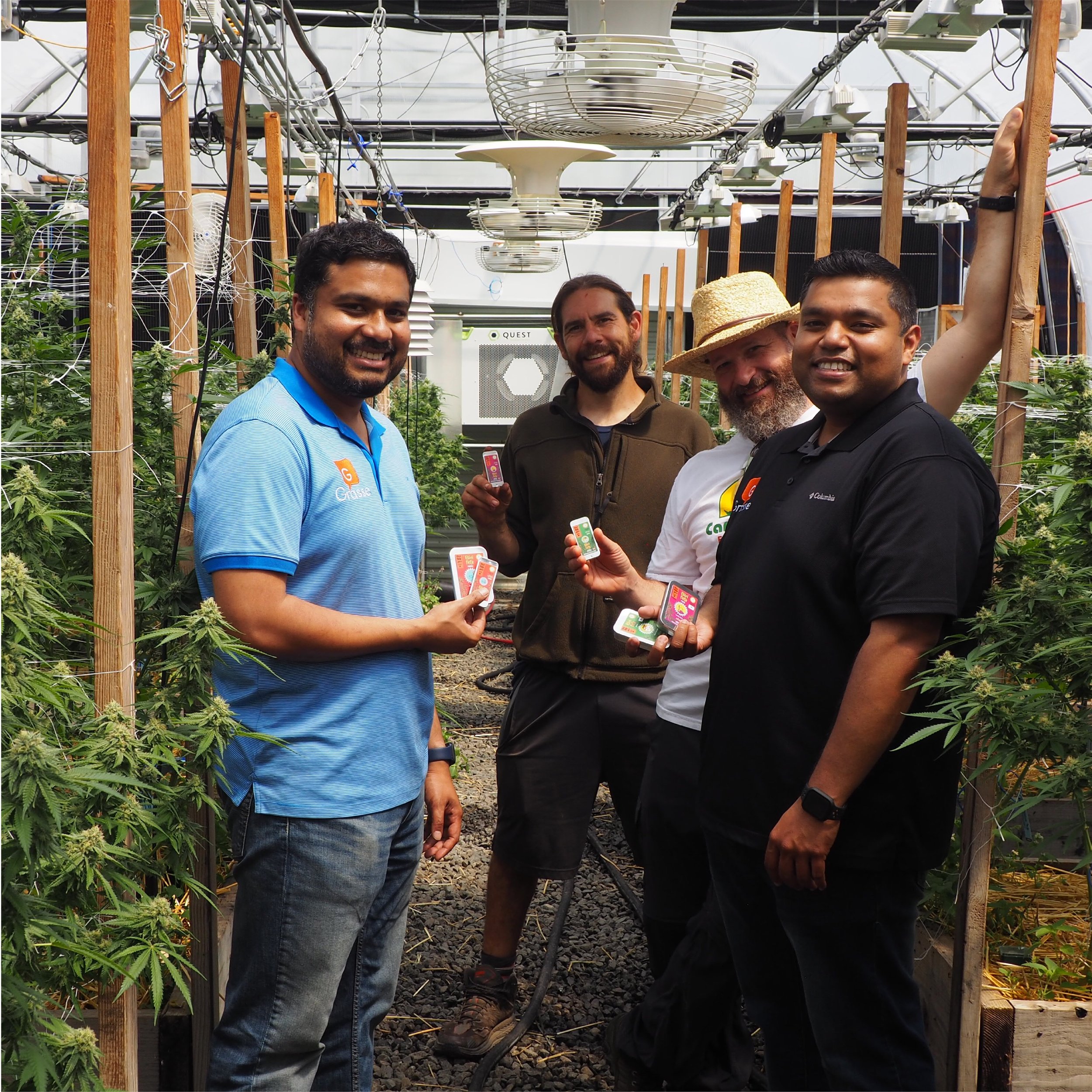
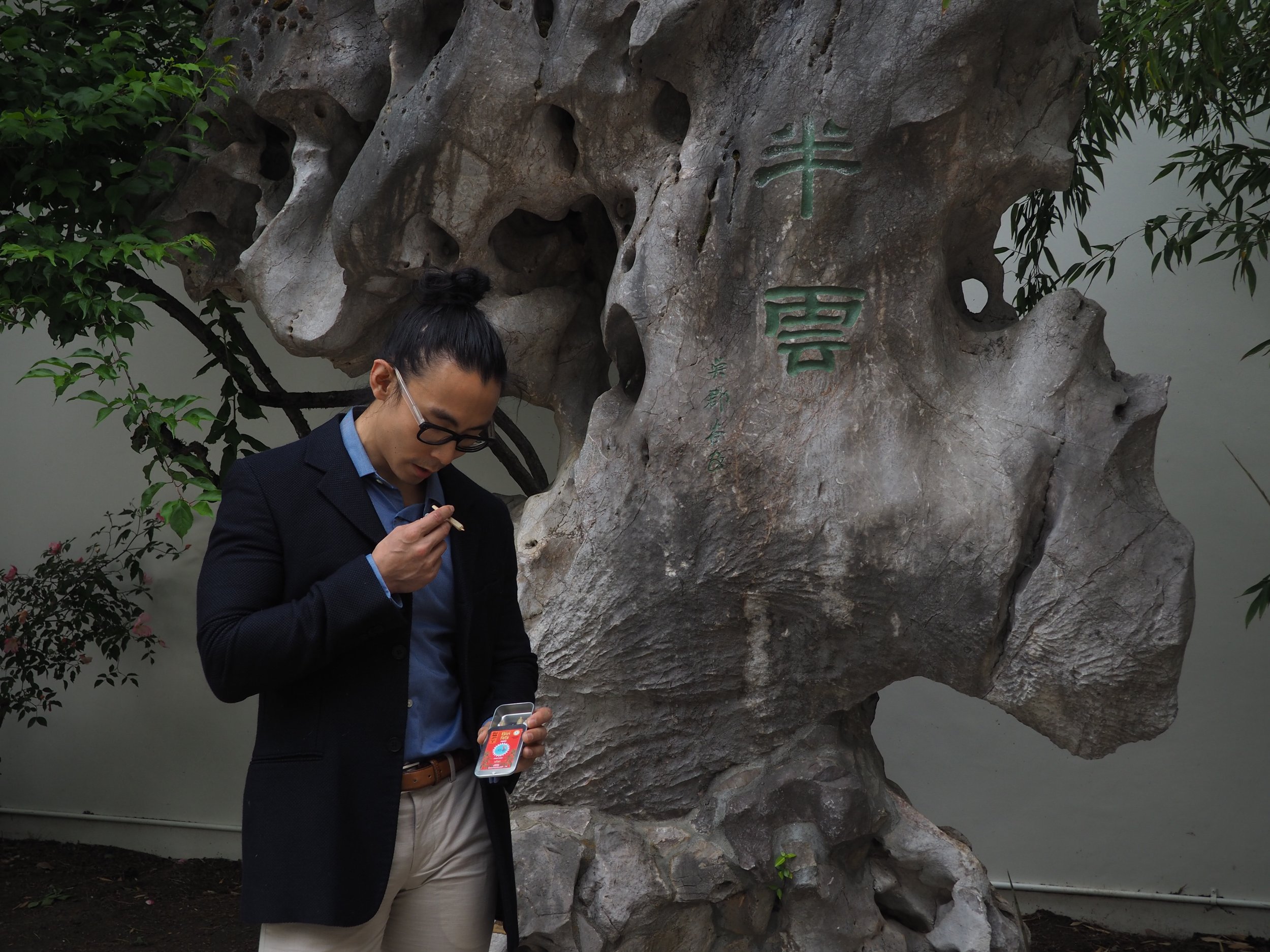
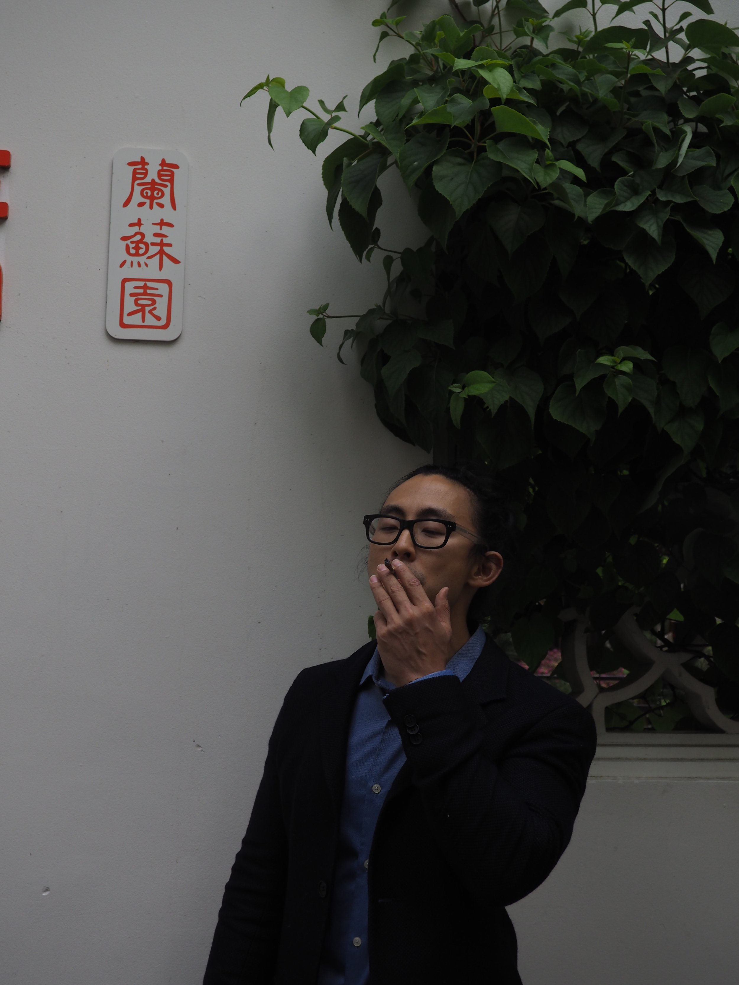
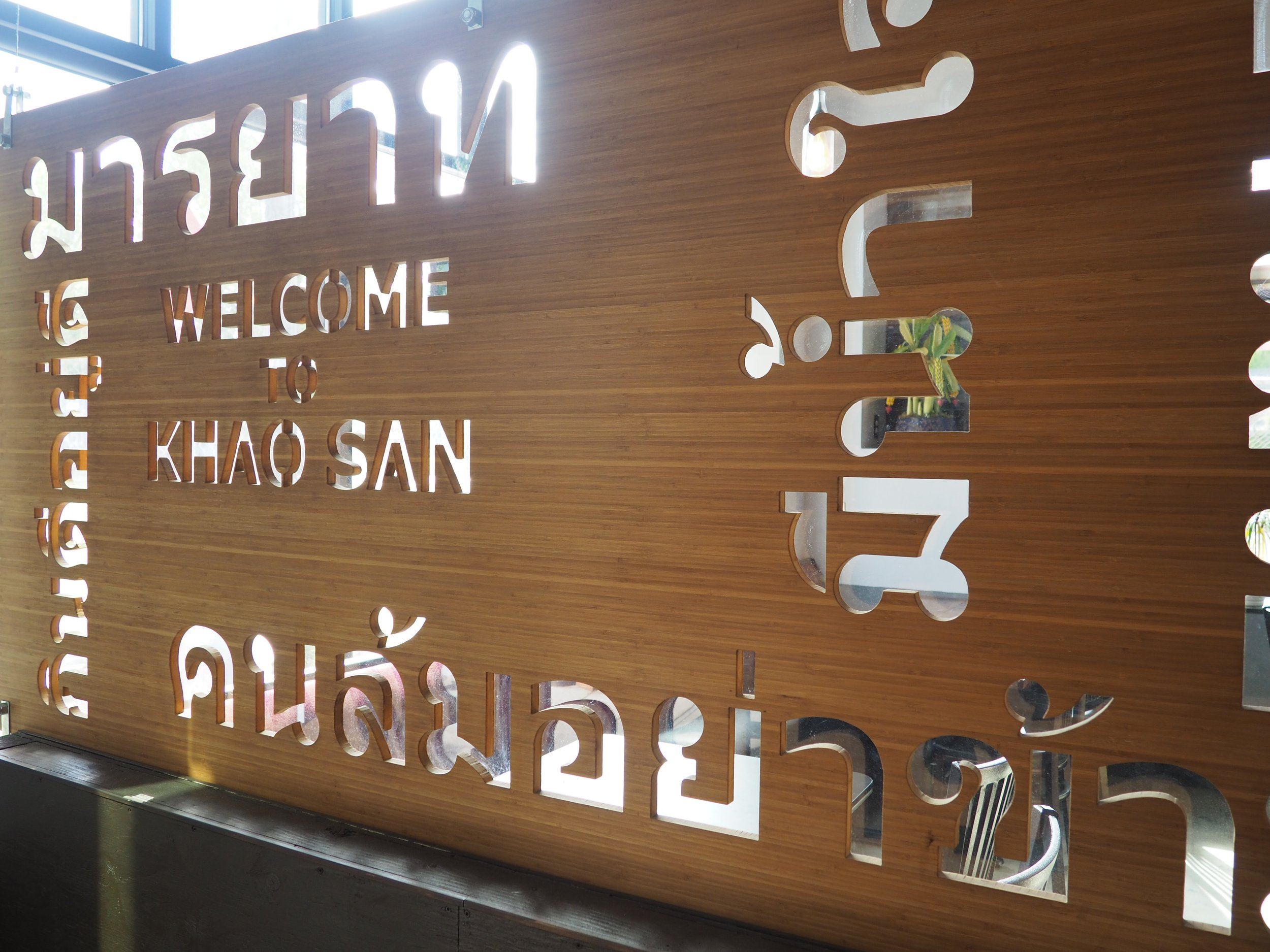
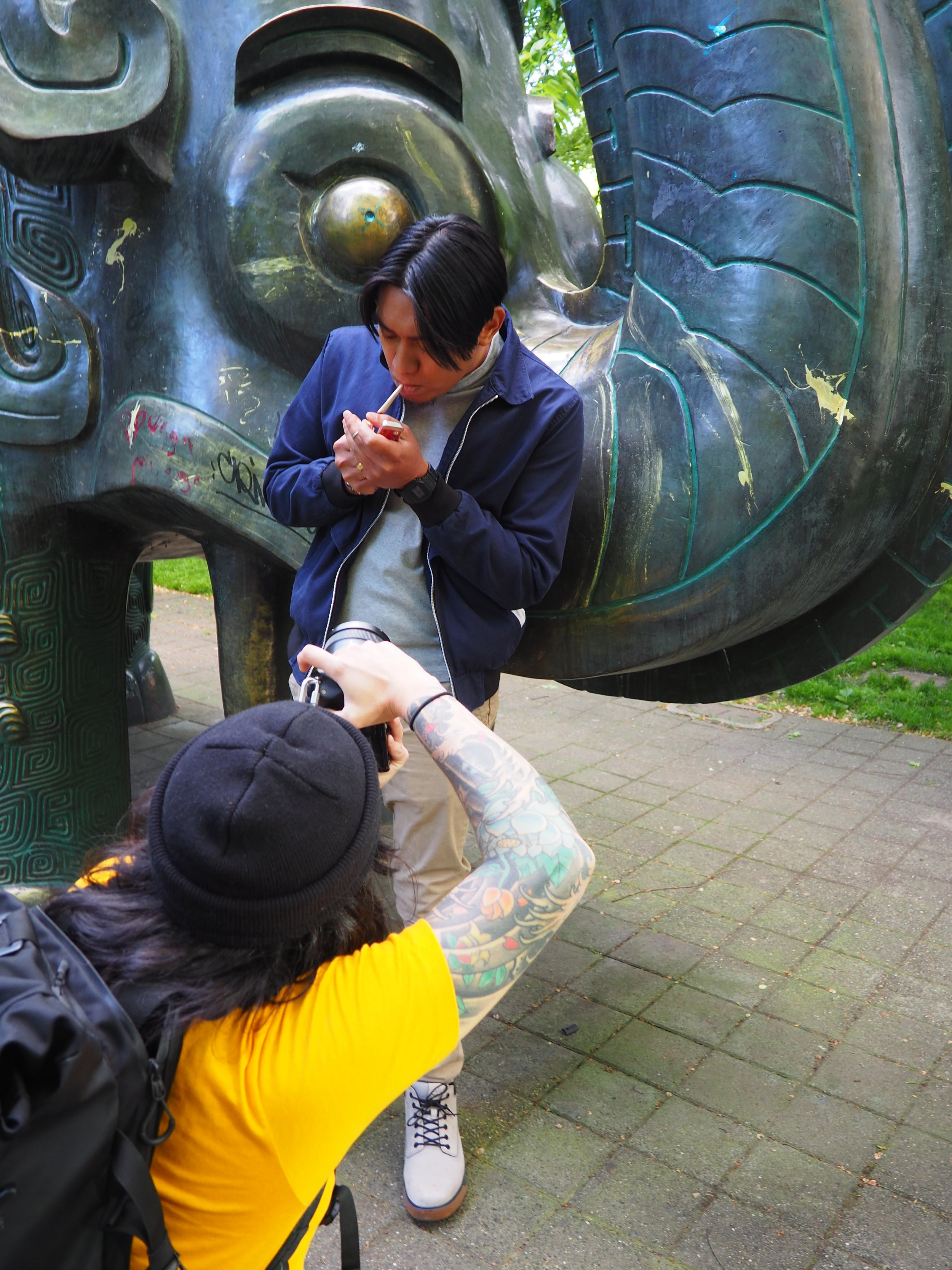
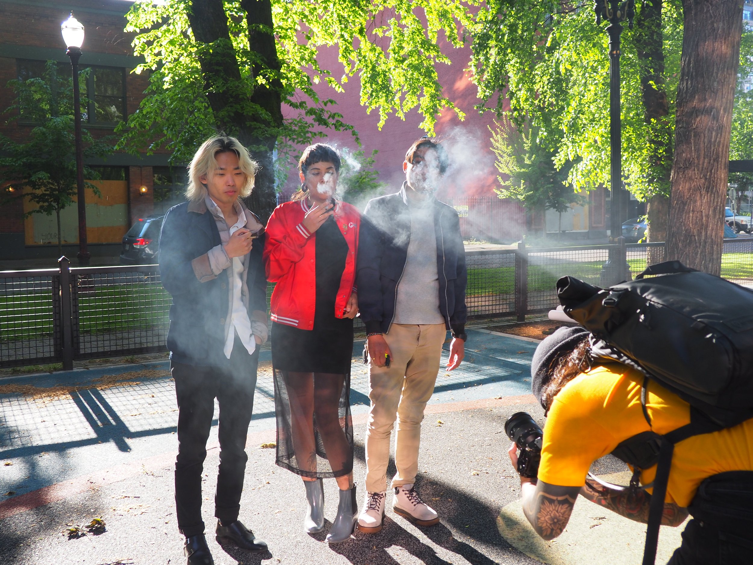
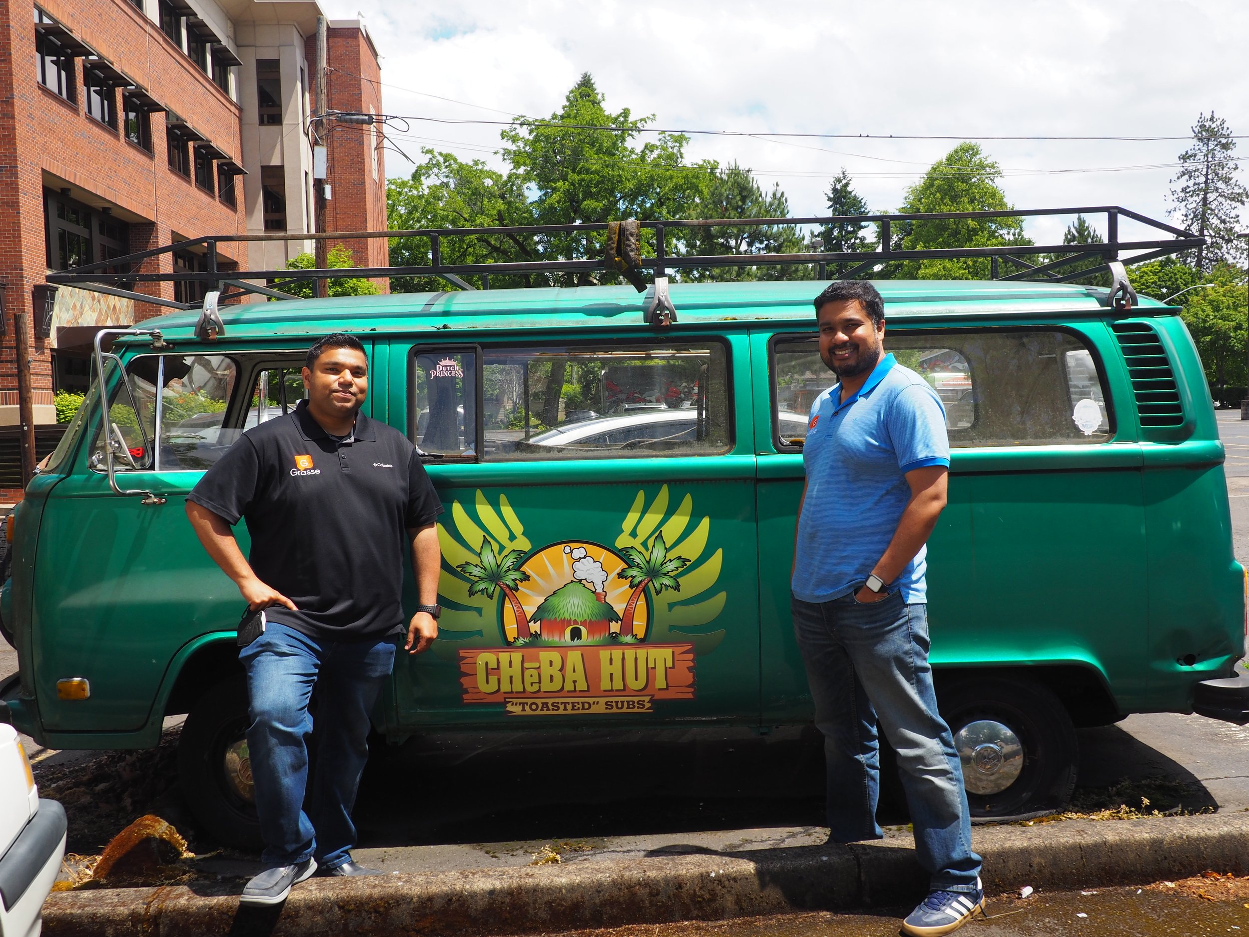
We brought the Biri vibe to Portland, Oregon and worked with a really amazing crew of local creatives from the Asian community to show the Biri brand in action. We worked with local Asian business owners and historical landmarks for locations. The real experience came full circle when we had all the Biri tins spread over a table of delicious Thai food and cocktails, served in a tuk tuk, and we could enjoy the labor of love for the community at large.
Reflection
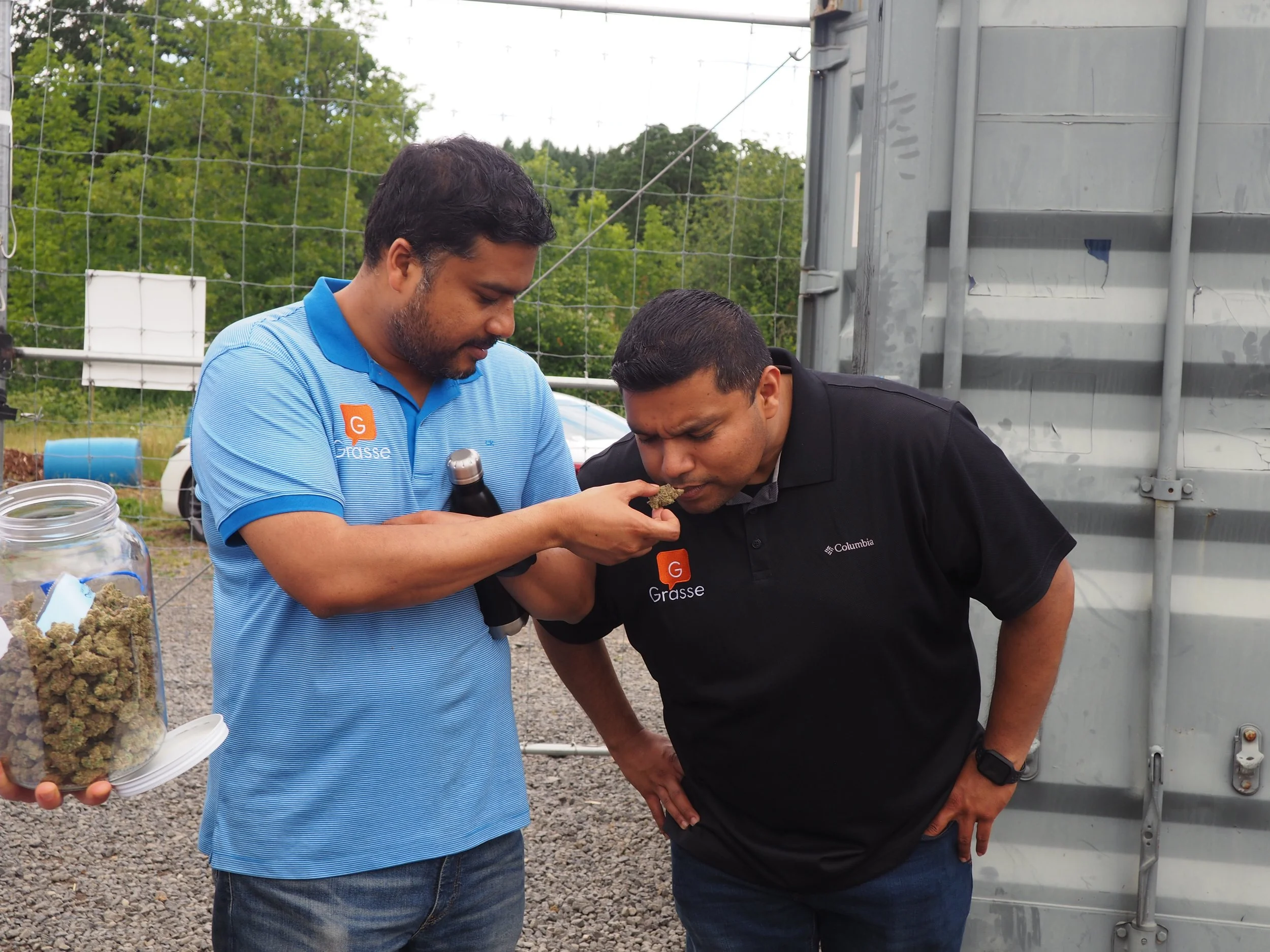
The Biri is blowing the doors off the marketplace with the brand presence. People are drawn to the colorful packaging and story behind it. Personally, this project was meaningful in the fact that it was a 100% Asian crew who all regularly consume cannabis. The craft product was a hit to begin with (who doesn’t love solventless infused prerolls?!), we just helped the authenticity and passion shine through.